Why Your Gray Paint Looks Purple, Green, or Blue Indoors
Clara Townsend
Clara Townsend is an interior stylist, vintage furniture enthusiast, and the creative voice behind Velvet Abode. With over a decade of experience transforming both cramped city apartments and sprawling fixer-uppers, she believes that a beautiful home is built on personal stories rather than massive budgets. When she isn't hunting for the perfect brass sconce at a local flea market, she can usually be found rearranging her living room for the third time this month.
There is a special kind of heartbreak that happens when you paint a room “the perfect soft gray,” step back, and realize you have somehow created a faint lavender box. Or a cool aquarium-blue vibe. Or a strange, hospital-y green cast that was definitely not in the plan.
Here is the honest truth: most grays are not truly neutral. They are polite little cocktails of pigment, and indoors they will absolutely reveal their secrets. The good news is you are not bad at choosing paint. You are simply seeing how light, neighboring colors, and undertones behave in real life.
Why gray paint “changes color” indoors
Paint does not technically change, but your perception does, depending on what kind of light hits the wall and what colors bounce around the space.
- Undertones are always present in gray paint, even when the swatch looks neutral in the store.
- Light temperature (warm vs cool bulbs, daylight vs evening) emphasizes certain undertones.
- Reflections from floors, rugs, cabinets, landscaping, and even a bold sofa can tint a wall.
- Room orientation (north, south, east, west) changes the color quality of daylight.
Think of gray as a white shirt. Under a warm lamp it looks creamy. Under cool LEDs it looks icy. Next to a bright green plant wall, it will look slightly… greenish. Your wall is doing the same thing.
The usual suspects: purple, blue, and green casts
If your gray looks purple
Purple usually shows up when a gray has violet or red undertones and the room lighting is warm or dim. Warm light can mute yellow in a space and make violet undertones feel louder, especially at night.
- Common triggers: warm 2700K bulbs, lots of beige or warm wood nearby, and north-facing daylight that is already cool and shadowy.
- What it often means: the paint is a “warm gray” with a violet lean, or a greige that tips mauve indoors.
If your gray looks blue
Blue happens when the gray has blue undertones or when cool light is dominating the room. North-facing rooms love to pull grays cooler, and cool LEDs can make even a balanced gray feel steely.
- Common triggers: 4000K to 6500K bulbs, lots of bright white surfaces, stainless steel, cool-toned tile, or a big north window.
- What it often means: the paint is a cool gray, or the room is making a neutral gray read cooler than expected.
If your gray looks green
Green is the sneakiest. Many popular “modern neutrals” have a green undertone because it helps them feel earthy and sophisticated. Then indoor lighting, wood floors, and outdoor greenery push that undertone forward.
- Common triggers: warm bulbs plus a lot of natural wood, beige carpet, olive textiles, or heavy green reflections from trees right outside the window.
- What it often means: your gray is actually a greige with a green base, and the room is amplifying it.
Five factors that make gray go sideways
1) Bulb temperature and bulb quality
Indoor lighting is the number one reason a “perfect” gray turns into a surprise color.
- 2700K feels cozy and golden. It can highlight purple or muddy a cool gray.
- 3000K is a balanced warm white that tends to be flattering in most homes.
- 3500K is a neutral white, often good for kitchens and baths.
- 4000K+ is cool and crisp, and it can push grays blue or make them feel stark.
Also check CRI (color rendering index). If your bulbs are low CRI, they can distort color and make paint look “off.” When possible, aim for 90+ CRI.
2) Room orientation
- North-facing: cool, steady light. Grays often read bluer, flatter, and more shadowy.
- South-facing: warm, strong light. Grays can look lighter and sometimes warmer.
- East-facing: warm in the morning, cooler later. Grays can shift dramatically by afternoon.
- West-facing: cooler early, very warm at sunset. Evening can bring out purple or warmth.
3) What your trim is doing
Trim color matters more than people think because it is usually the closest “neighbor color” to your walls. A bright, cool white trim can make a wall gray look warmer or more colorful by comparison. A creamy trim can make the wall appear cooler.
4) Large surfaces reflecting onto the walls
Paint is a mirror in slow motion. Big elements cast color onto it: wood floors, a red brick fireplace, a giant navy sectional, a vivid rug, even a dense hedge outside. That reflected color is called color bounce, and it is very real.
5) The finish you chose
Higher sheen paints bounce more light, which can intensify whatever undertone is present. Flat or matte finishes tend to read truer and softer, especially on large wall expanses.
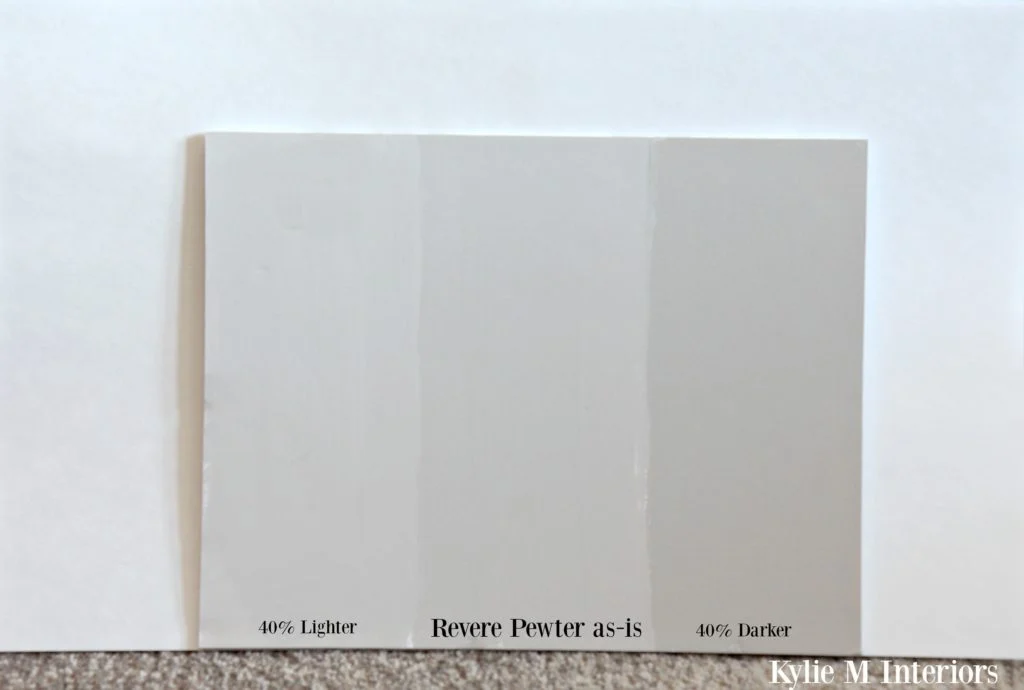
How to test gray paint so it stops surprising you
Swatches are liars. Not because brands are evil, but because a tiny rectangle cannot predict how a color behaves across an entire room.
Use a bigger sample than you think you need
- Paint at least a 2 ft by 2 ft square, larger if possible.
- Even better: paint a poster board so you can move it around the room.
Test on multiple walls
Put a sample on the wall that gets the most daylight, and another on the wall that lives in shadow. If you only test near the window, you are only seeing one version of the color.
Look at it across a full day
- Morning: often clearer and cooler.
- Midday: brightest and most “honest.”
- Evening: undertones come out to play under lamps.
Check it next to your fixed finishes
Hold the sample next to anything that is not changing soon: flooring, counters, tile, cabinets, and the biggest upholstered piece in the room.
Do one last test under your actual bulbs
Turn on every lamp you normally use. If you rarely use the overhead light, stop judging paint under the overhead light.
How to fix a gray wall that looks purple, green, or blue
Before you repaint, try the gentler fixes. You can often pull a gray back toward neutral by changing what is around it.
Fix 1: Swap your bulbs first
This is the fastest, least expensive change, and it can be shockingly effective.
- If your gray looks purple at night, try moving from 2700K to 3000K with a 90+ CRI bulb.
- If your gray looks blue and cold, try a slightly warmer bulb (often 3000K).
- If your gray looks green and swampy, avoid overly warm, yellow bulbs. Try 3000K to 3500K and high CRI.
Fix 2: Adjust the trim color
Trim acts like a frame. If your trim is a very cool, bright white, it can exaggerate undertones in the wall color.
- To calm purple or blue, consider a slightly softer white trim (less icy, more gentle).
- To calm green, sometimes a cleaner, more neutral white trim helps, especially if your current trim is creamy and pushing the wall toward green.
If repainting trim sounds like a lot, you can test this with a painted sample board of a different trim white placed along the baseboard line. It is not perfect, but it gives you a read.
Fix 3: Style to blend, not “cancel”
This is my favorite fix because it feels like styling, not damage control. Just a quick color-theory note: putting a strong complementary color next to an undertone does not mute it. It usually creates contrast, which makes the undertone look even louder. If your goal is to downplay the weirdness, think analogous, monochromatic, and quiet.
- If the gray looks purple, avoid high-contrast yellows and chartreuse that will make the violet pop. Instead, layer soft neighboring tones like smoky lilac, dusty plum, warm taupe, and gentle mauves, plus lots of texture (linen, wool, matte ceramics) to help the wall read calmer.
- If the gray looks blue, skip bright oranges that will make it feel bluer. Try soft blue-grays, inky navy accents, and neutrals that stay in the same family (white, dove, charcoal). If you want warmth, keep it subtle and low-saturation, like warm oak, parchment, or a muted camel that reads more neutral than orange.
- If the gray looks green, be careful with red-pink “correctors” in decor because they can make the green look greener. Instead, lean into earthy, neighboring tones: sage, stone, taupe, mushroom, and soft black. Even a simple switch to less yellow-beige textiles can help.
Translation: if you want the walls to fade into the background, give your eye fewer color arguments to focus on.
Fix 4: Use a different sheen or add soft contrast
If the walls feel too reflective or too “colorful,” consider repainting in the same color but a lower sheen (like matte). Also, adding soft contrast like darker frames, deeper textiles, or a warm-toned rug can keep the gray from reading as the main event.
Fix 5: Repaint, but choose the “corrected” gray
Sometimes a gray is simply not the right gray for your specific room. That is not a failure. It is just data.
- If your wall looks purple, look for grays labeled as having green or yellow undertones (very subtle), or a more balanced neutral.
- If it looks blue, look for a gray with a hint of warmth (often described as greige or taupe-leaning).
- If it looks green, try a gray with a violet undertone to calm it down, or a cleaner true gray that is less earthy.
A helpful trick: if you are repainting, pick three options in the same family, then choose the one that looks almost boring on the sample board. In many homes, the “boring” sample becomes perfect on the full wall.
A quick, no-shame troubleshooting checklist
If you want the fastest route to “okay, what is actually happening here,” walk through this list:
- What direction do my windows face, and when do I use the room most?
- What Kelvin are my bulbs, and are they high CRI?
- Is my trim bright cool white or creamy warm white?
- What are the biggest color sources in the room (floor, rug, sofa, cabinets)?
- Is there greenery or a colored exterior surface reflecting through the windows?
- Am I judging this color only at night, or only on a sunny day?
If your gray looks wrong in one specific lighting situation, that is usually a lighting problem. If it looks wrong all day long, that is usually an undertone mismatch.
Final thought from a fellow rearranger
Grays are moody. They are sensitive. They are the kind of paint color that demands you meet it where it lives, in your exact room, with your exact bulbs, next to your exact floors.
So if your gray is suddenly purple, green, or blue, take a breath. You did not “mess up.” You just discovered your home’s unique light signature. And once you work with that light, instead of against it, your walls will settle into that calm, cozy, comforting hug of a neutral you were after in the first place.