Warm White vs Cool White Paint
Clara Townsend
Clara Townsend is an interior stylist, vintage furniture enthusiast, and the creative voice behind Velvet Abode. With over a decade of experience transforming both cramped city apartments and sprawling fixer-uppers, she believes that a beautiful home is built on personal stories rather than massive budgets. When she isn't hunting for the perfect brass sconce at a local flea market, she can usually be found rearranging her living room for the third time this month.
White paint seems like it should be simple. Then you hold up two “whites” and suddenly one looks like whipped cream and the other looks like a hospital hallway.
The secret is undertone. White is not just white. It is a barely-there tint hiding underneath, and that tint wakes up depending on your light, your floors, and everything that is not changing in the room (tile, countertops, trim, brick).
Warm vs cool white in plain language
When people say “warm white” or “cool white,” they are usually reacting to the undertone.
- Warm white reads cozy and candlelit. It often has cream, yellow, or pink-beige hiding underneath.
- Cool white reads crisp and airy. It often has blue, violet, or green-gray underneath.
Neither is better. The right one is the one that plays nicely with your fixed finishes and your natural light.
Undertones you will actually notice
Here are the four undertone families that show up again and again, explained the way you will see them on your walls.
Cream undertone
Looks like: soft butter, steamed milk, antique lace.
Feels like: warm, traditional, quietly flattering.
Watch for: can look more yellow next to bright white tile or very cool LED bulbs.
Pink-beige undertone
Looks like: a whisper of blush, warm putty, “skin-toned” white.
Feels like: cozy and romantic, especially with vintage wood and brass.
Watch for: can turn noticeably pink next to cool gray floors or icy stone.
Green-gray undertone
Looks like: soft sage haze, mushroom with a green lean, gentle gray.
Feels like: calm, grounded, subtly modern.
Watch for: green pops out near red-toned woods, terracotta, or warm brick.
Blue-white undertone
Looks like: snowy, crisp, sometimes slightly icy.
Feels like: clean and contemporary, great for high-contrast spaces.
Watch for: in north light it can feel chilly. Next to creamy trim it can look stark or even a bit lavender.
Why your room’s light changes everything
This is the part that makes people swear the paint store “mixed it wrong.” Most of the time, it is the light.
North-facing light
North light is steady and cooler. It tends to pull out blue, gray, and green undertones.
- If you paint a north room with a cool blue-white, it can look extra icy.
- A warm white often balances the coolness and reads more welcoming.
South-facing light
South light is warm and strong. It amplifies cream, yellow, and pink-beige.
- Warm whites can look richer, sometimes too yellow if the undertone is strong.
- Cool whites can look beautifully bright and clean without feeling cold.
East and west light (the drama queens)
- East-facing: warm, golden direct sun in the morning, then cooler, grayer, and more shadowy later in the day. Morning can make warm whites glow (and make creamy undertones look extra creamy).
- West-facing: often cooler earlier, then warmer afternoon and evening light. Warm undertones glow, and pink-beige can go rosy at sunset.
My simple rule: judge your samples in the “worst” light too. If it looks good on a gloomy afternoon, it will usually look great the rest of the time.
LRV and sheen basics
If you have been shopping for white paint, you have probably seen three letters that feel weirdly serious: LRV.
LRV (Light Reflectance Value) is a number, usually from 0 to 100, that tells you how much light a color reflects. Higher LRV means the paint reflects more light and tends to look brighter. Lower LRV means it absorbs more light and can look deeper, moodier, or in some rooms, a bit muddy.
- High LRV whites (often in the 85 to 95 range) can look crisp and bright, but they can also feel stark in very cool light.
- Mid LRV whites (often around 75 to 85) are frequently the sweet spot for “soft white” walls, especially in older homes or rooms with warm wood.
- Lower LRV off-whites (below about 75) can read creamy or greige, and they are more sensitive to shadows in hallways and north rooms.
One important note: LRV does not tell you undertone. It tells you brightness. Two whites can have a similar LRV and still look completely different because one leans pink-beige and the other leans green-gray.
Sheen matters too
Sheen changes how light bounces around, which changes how white looks.
- Flat or matte: soft, forgiving, and great for walls where you want a calm look. It can make a white feel a touch softer (and sometimes a touch less bright).
- Eggshell or satin: a little more reflective and easier to wipe. It can make undertones show up faster because more light is bouncing back.
- Semi-gloss: commonly used on trim and doors. It reflects a lot of light, so trim often looks “whiter” than the same color on a wall in matte.
Translation: if you are trying to match walls and trim, sheen alone can make them look different even if the paint color is identical.
Pairing white paint with wood trim and floors
Wood has an undertone too. That is why “the perfect white” in one home can look completely wrong in another.
Honey oak, orange-toned oak, or golden pine
- Usually best: a white with a soft cream or gentle warm undertone that does not fight the gold.
- Avoid (often): icy blue-whites that make the wood look more orange by contrast.
Red-toned woods (cherry, some walnuts, red oak)
- Usually best: a neutral warm or a quiet green-gray that calms the red.
- Avoid (often): pink-beige whites, which can amplify the rosy cast.
Cool or gray-washed floors
- Usually best: whites with green-gray or blue undertones so the floor and wall feel related.
- Avoid (often): creamy whites that can look dingy against cool floors.
Very dark stained wood
- Usually best: either direction works, but choose based on the mood. Warm white reads classic and library-like. Cool white reads modern and high contrast.
Room-by-room: what tends to work
These are not hard rules. They are starting points that keep you out of the most common white-paint heartbreak.
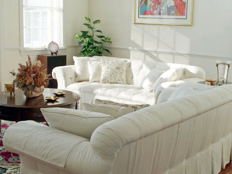
Living room
Living rooms usually want comfort. If you have lots of textiles and warm metals, a warm white often looks intentional and soft. In very bright, modern living rooms with cool stone or black accents, a cleaner cool white can feel fresh.
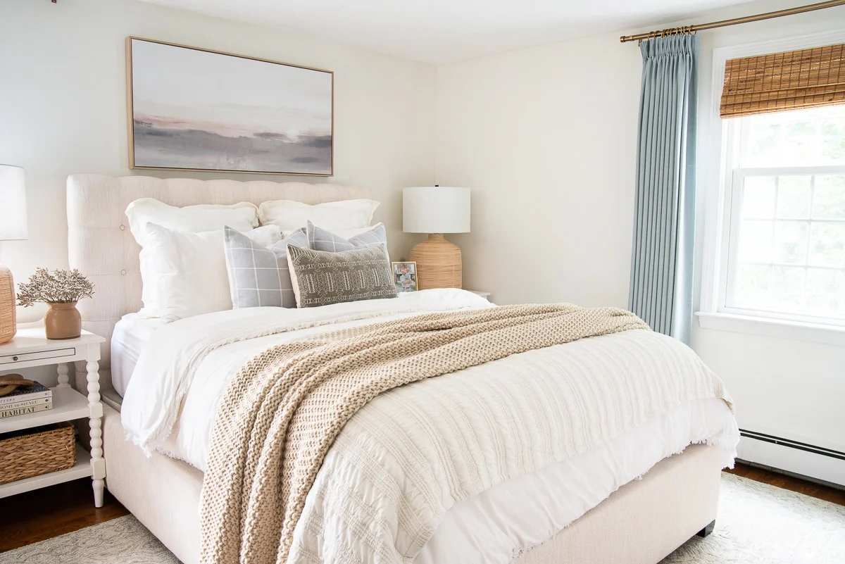
Bedroom
Bedrooms love a flattering white. A pink-beige or soft cream undertone can make skin tones look warmer and the whole room feel like a calm exhale. In a south-facing bedroom, just keep the warmth subtle so it does not turn buttery.
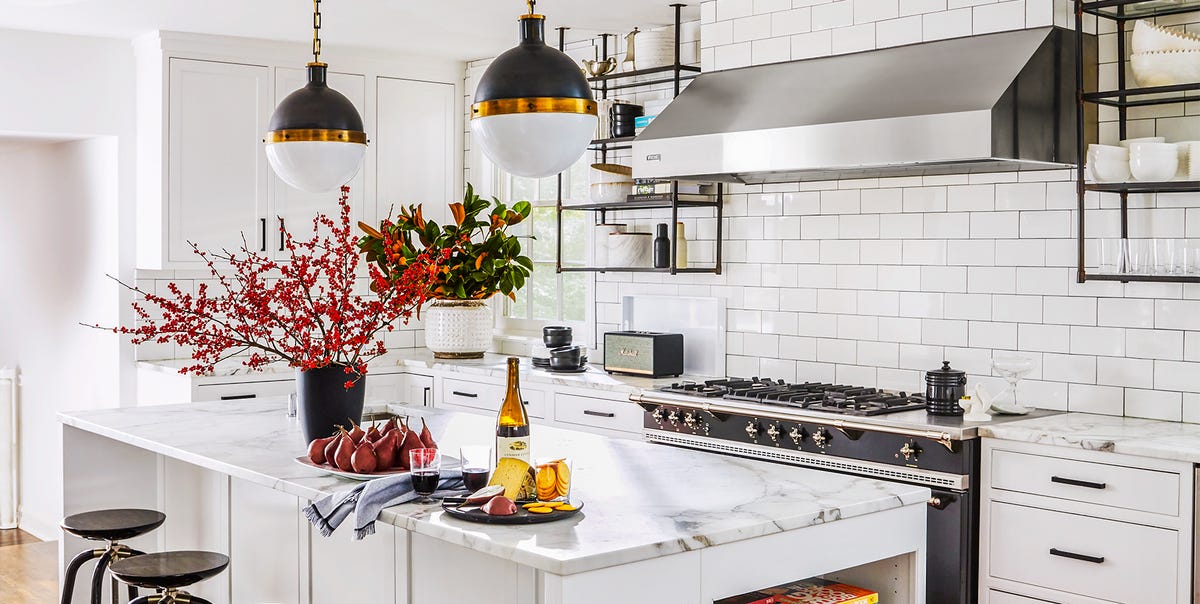
Kitchen
Kitchens are ruled by fixed finishes. Countertops, backsplash tile, cabinets, and appliances will boss your white around.
- Lots of stainless and cool stone: lean cool white or green-gray.
- Warm butcher block, brass, creamy cabinets: lean warm white.
- Bright white quartz and stark subway tile: pick a white that is not too creamy, or the wall can look yellow next to the counters.
Bathroom
Bathrooms are reflective. Tile and mirrors bounce color everywhere. Cool whites can look crisp with marble and chrome, but in dim bathrooms they can feel cold. A very light neutral warm is often the safest “pretty in any light” choice, especially if your bulbs are on the warm side.
Hallways and entryways
These spaces often get limited daylight. Warm whites keep them from feeling flat or shadowy. If your hallway has cool gray floors, a green-gray undertone white can keep it from going yellow.
Home office
If you want focus and clarity, a cool white can feel energizing. If you want cozy creativity, a warm white paired with warm lighting reads inviting. The key is to match the wall to your lighting temperature so it does not look “off” on video calls.
A simple decision flowchart
Use this quick path before you ever fall in love with a paint name.
1) What is the MOST fixed finish in the room?
   - Warm (honey oak, beige tile, cream stone, brass)  → go warmer
   - Cool (gray floors, white marble, chrome, blue tile) → go cooler

2) What direction is the main window?
   - North (cool light)  → nudge warmer or neutral
   - South (warm light)  → nudge cooler or neutral
   - East (warm morning, cooler afternoon) → choose balanced, check both times
   - West (cooler morning, warm evening) → test at sunset before committing

3) What is your trim and ceiling color?
   - Creamy trim already in place → avoid icy blue-white walls
   - Bright white trim → avoid very creamy walls unless you want contrast

4) What is the LRV range you want?
   - Need it brighter (dark room, lots of shadows) → consider higher LRV
   - Want softer (glare, sunny room, lots of white tile) → consider mid LRV

5) Sample check (non-negotiable):
   - Tape 2 to 4 large swatches
   - Look morning, afternoon, night
   - Decide using the worst light
If you want an even simpler shortcut: match undertones, not darkness. A light warm white and a deeper warm beige will still feel harmonious because they share the same “temperature.”
Common mistakes that make a white look wrong
I have watched these happen in real homes, including my own early-apartment adventures. They are painfully common and very fixable.
Mistake 1: Skipping the backsplash or countertop check
That slightly creamy white you loved on Pinterest can look yellow-green next to a cool white quartz or bright subway tile. Always sample next to your most dominant fixed finish.
Mistake 2: Ignoring trim that is staying
If your trim is a warm, older off-white and you paint the walls a blue-white, the trim can suddenly look dirty. Either commit to repainting trim, or pick a wall white that harmonizes with it.
Mistake 3: Testing on a tiny chip only
Those little cards are useful for narrowing options, but they lie by omission. Undertone shows up when you see a larger field of color. Use a big sample, or paint a poster board and move it around the room.
Mistake 4: Forgetting bulbs are part of the color
Warm bulbs (around 2700K to 3000K) make warm whites warmer. Cool bulbs (3500K to 5000K) can make warm whites look dull and can push cool whites into “stark.” Pick bulbs intentionally, then judge paint.
Mistake 5: Treating LRV like a magic answer
LRV is helpful, but it is not a personality test. A high LRV white can still look cold, and a mid LRV white can still look muddy if the undertone fights your finishes. Use LRV to gauge brightness, then use undertone to make it look right.
How to test white paint like a stylist
- Sample 3 whites that are close. One warm, one cool, one in-between. The “middle” choice often wins.
- Place them vertically so you can see how they react near the floor and near the ceiling.
- Check next to fabric you love, like your sofa, rug, or bedding. Undertone shows up fast next to textiles.
- Look at corners. Corners exaggerate undertone because of shadows.
- Live with it for 48 hours. A white you hate at 8 p.m. is not your white.
If you are torn between two, choose the one that makes your fixed finishes look more expensive. The right white quietly flatters everything else.
Quick cheat sheet
- North light + warm woods: warm white or neutral warm, avoid icy blue-white.
- South light + creamy finishes: neutral to slightly cool white to prevent “butter.”
- East light: check morning and afternoon. Morning warmth can make creamy whites read richer.
- West light: test at sunset. Pink-beige can go rosy later in the day.
- Gray floors + chrome: cool white or green-gray white.
- Red-toned wood + brick: neutral warm or gentle green-gray, be careful with pink-beige.
- Existing creamy trim: keep the walls from going too blue.
- Need brighter walls: look at LRV to avoid a white that goes flat in shadows.
The takeaway
Picking the right white is less about finding a “best” paint and more about spotting what your room is already doing.
Start with your fixed finishes, check your window direction, then choose an undertone that feels like it belongs. Use LRV to sanity-check how bright the color will feel, and remember sheen can make the same paint look different on trim versus walls.
When in doubt, sample bigger than you think you need and let the room tell you the truth in morning light and at night with the lamps on.
That is when white stops being stressful and starts being what it should be: a soft backdrop for your life, your vintage finds, and all the little stories you are building at home.