Mixing Patterns in a Living Room Without the Chaos

Clara Townsend
Clara Townsend is an interior stylist, vintage furniture enthusiast, and the creative voice behind Velvet Abode. With over a decade of experience transforming both cramped city apartments and sprawling fixer-uppers, she believes that a beautiful home is built on personal stories rather than massive budgets. When she isn't hunting for the perfect brass sconce at a local flea market, she can usually be found rearranging her living room for the third time this month.
If mixing patterns makes you nervous, you are not alone. Patterns feel like they have opinions, and when you invite too many into one room, they can start arguing.
But when you mix them with a little structure, patterns do what they do best: add warmth, depth, and that lived-in charm that makes a living room feel like a story, not a showroom.
Here is the framework I use when I am styling a real home with real life happening in it. Kids, pets, movie nights, and the occasional spilled coffee included. It works whether you are starting from scratch or just trying to make your new floral pillows stop fighting your striped chair.
The simple framework
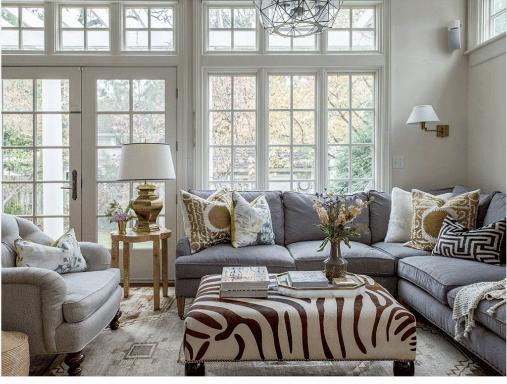
When a room looks chaotic, in my experience it is usually missing one of these four things:
- An anchor: 2 to 3 shared colors that tie everything together.
- Scale variation: patterns that are not all the same visual volume.
- Repetition: at least one pattern type that shows up twice so it feels intentional.
- Breathing room: quiet surfaces that let your patterned pieces shine.
Keep this in mind as you mix stripes, florals, and geometrics, and you will be surprised how designed it starts to look.
Step 1: Choose anchor colors
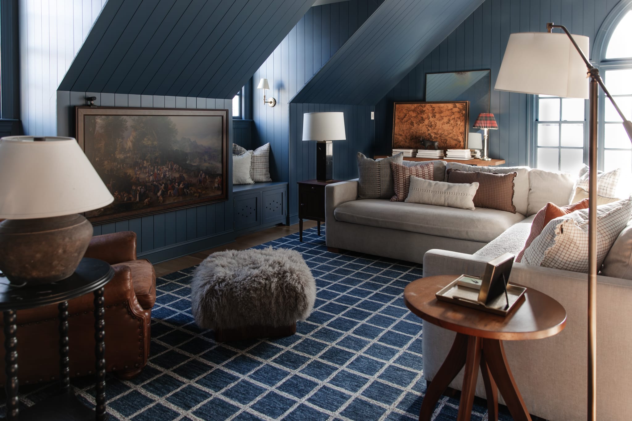
Before you choose pattern types, choose your anchor colors. This is the quickest way to make unrelated prints feel like they belong at the same party.
How to choose anchor colors
- Start with what cannot change easily: your sofa, wall color, or rug.
- Choose 2 to 3 colors you can repeat across the room. One can be a neutral.
- Repeat each anchor color at least twice across your textiles and decor so it reads as intentional.
- Use one bridge color that appears in every patterned piece, even if it is just a thin line.
Example: If your rug has warm cream, dusty blue, and a little caramel, let those be your anchors. Suddenly a blue stripe, a floral with blue vines, and a geometric with tiny caramel dots all feel related.
Step 2: Vary the scale
If everything is the same size, your eye does not know where to land. That is when the room starts to feel like it is vibrating. The fix is simple: mix large, medium, and small scale patterns.
A reliable scale recipe
- One large-scale pattern (big floral, bold stripe, oversized geometric)
- One medium pattern (classic stripe, moderate geometric repeat)
- One small texture-like pattern (tiny check, dotted print, subtle block print)
Think of it like music. You need bass, melody, and a little percussion. Too much percussion can start to feel like noise.
Step 3: Mix pattern types
This is my easiest starting point: Stripe + Floral + Geometric. It is not the only way, but it is a reliably good one because each pattern does a different job. Stripes feel structured. Florals feel organic. Geometrics add rhythm. Combine them with shared anchor colors and varied scale, and they look collected instead of chaotic.
Stripes
Stripes can read almost like a neutral when they are low contrast or in classic, quiet colorways. High-contrast stripes or rainbow stripes can absolutely be the loudest thing in the room, so treat them like a statement when they are bold.
- Use stripes on pillows, curtains, or an ottoman.
- Keep stripe colors tied to your anchor palette.
- Wide stripes feel bolder, pinstripes feel calmer.
Florals
Florals bring emotion and softness. They are wonderful for making modern rooms feel less stark.
- Choose a floral that includes at least two of your anchor colors.
- If your room already has a lot of straight lines, a looser botanical print balances it beautifully.
- Prefer something moodier and grown-up? Look for florals with a darker ground, like ink, chocolate, or deep olive.
Geometrics
Geometrics help bridge vintage and contemporary pieces. They add a clean, graphic note that keeps florals from feeling too sweet.
- Try geometrics in rugs, throws, or accent chairs.
- Smaller geometrics can act like texture, especially in neutral tones.
Step 4: Repeat on purpose
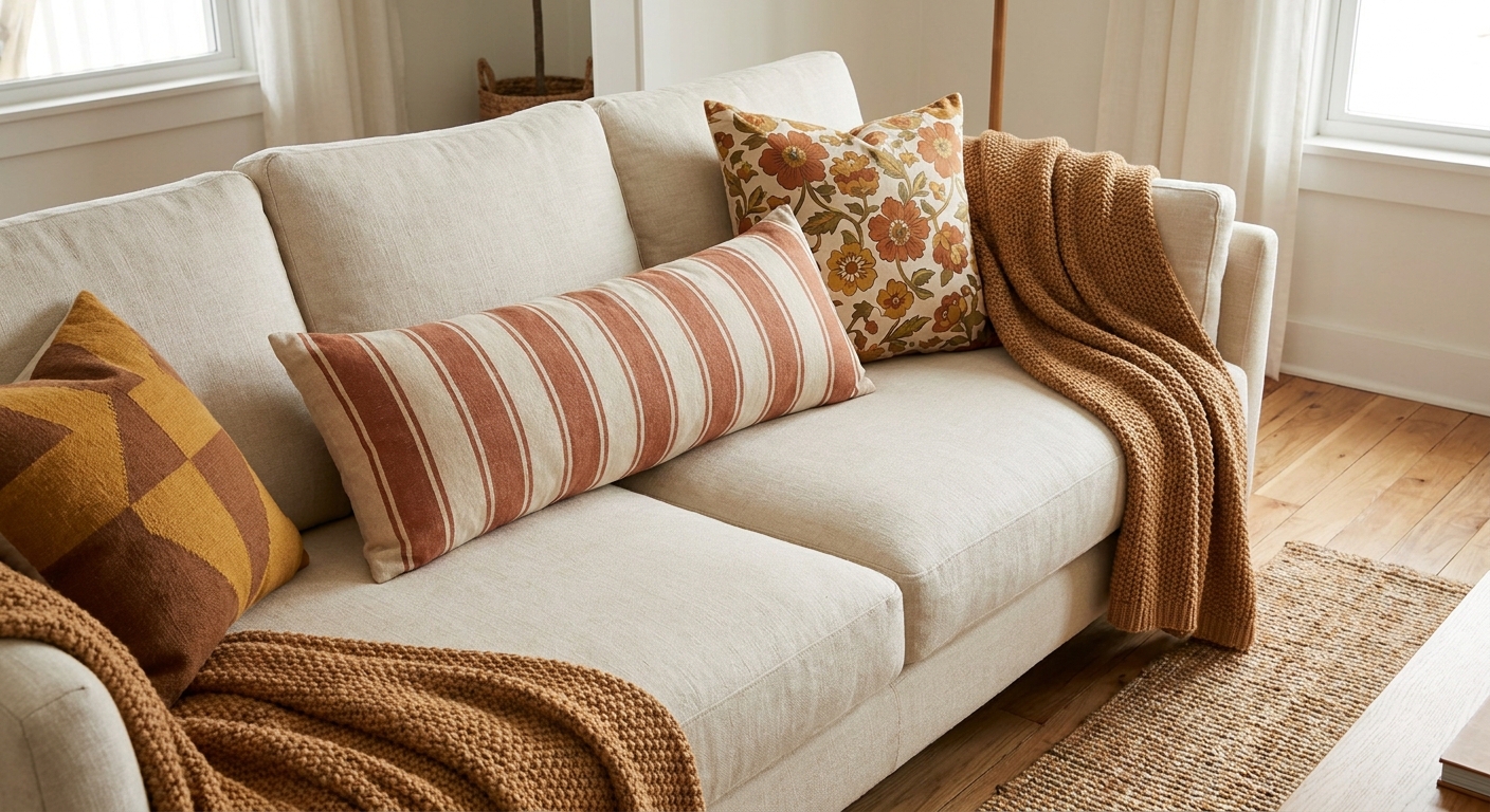
This is the secret that makes a mixed-pattern room feel curated. Pick one pattern type to echo around the room.
Easy repetition ideas
- Stripes twice: striped pillow plus striped lampshade, or striped curtain plus striped throw.
- Florals twice: floral pillow plus a small floral art print, or floral accent chair plus floral cushion.
- Geometrics twice: geometric rug plus geometric cushion, or geometric throw plus geometric pottery on a shelf.
Repetition is what turns “I found these and liked them” into “I meant to do this.”
Step 5: Let it breathe
Patterns need calm neighbors. If you are using a bold patterned sofa or a loud rug, let something else go quieter so the room can breathe.
If your sofa is patterned
- Keep the rug simple or lightly textured (jute, flatweave, subtle tonal pattern).
- Choose pillows that are lower contrast than the sofa, or stay in the same color family.
- Let the walls be a soft neutral, or a single-color paint that does not compete.
If your rug is patterned
- Choose solid upholstery, or upholstery with a very small-scale pattern.
- Pull pillow colors straight from the rug, like you are borrowing ingredients from a recipe.
Quiet is not boring
Quiet can be linen, boucle, leather, raw wood, plaster, velvet in a solid color, or a creamy wall with a soft sheen. If you dislike solids, go for tone-on-tone pattern (a subtle stripe, a faint check, a low-contrast geometric) so you still get calm without going blank. Texture is your best friend when you are letting color and pattern do the talking.
What to do first
If you are mixing patterns across the whole room, not just pillows, follow this order. It keeps you from buying five things that do not speak to each other.
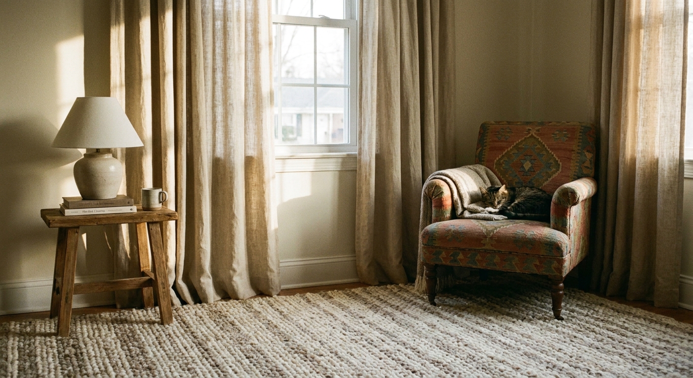
- Start with the rug (or your sofa if it is staying). It usually holds the strongest pattern and most color information.
- Choose curtains next (solid or subtle pattern) to set the room’s calm level.
- Add upholstery patterns last (chairs, ottomans) so they complement what is already established.
- Finish with pillows, throws, and small decor. This is where you can take the most risks, because it is easiest to swap.
Mixing styles and eras
Traditional florals and modern geometrics can absolutely live together. The trick is to give them a shared language.
- Match the mood: a crisp black-and-ivory geo looks best with a floral that has some contrast too, not a pale pastel that feels unrelated.
- Match the finish: if your room leans modern and clean, choose a floral with a simpler outline or a limited palette. If your room leans vintage, choose a geometric that looks woven or printed, not glossy and sharp.
- Use one bridge element: a throw, a piece of art, or even a ceramic lamp that contains both vibes (organic shape, graphic color) helps everything click.
Mini case study: neutral sofa
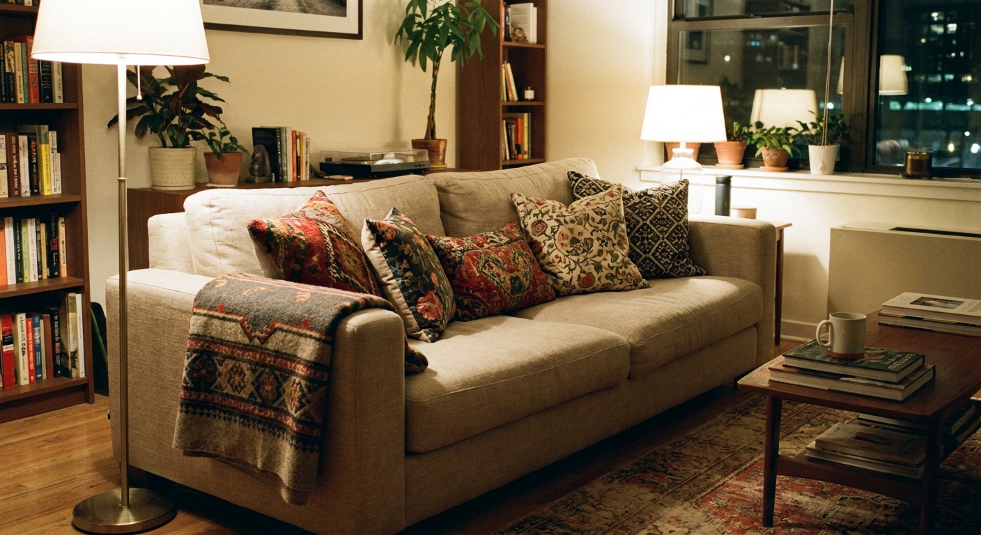
Let’s make this practical. Imagine a warm neutral sofa and a vintage-style rug with cream, dusty blue, and caramel.
Three pillow picks
- Large: a medium to large floral pillow with blue vines and a cream background.
- Medium: a blue-and-cream stripe (keep it lower contrast if you want calm).
- Small: a tiny geometric or dotted print that includes caramel, even if it is just little stitches.
Add one solid or textured pillow (linen, velvet, chunky knit) if you want extra breathing room, especially in a family room where you want cozy, not busy.
Pattern direction tips
- Vertical stripes tend to make a space feel taller.
- Horizontal stripes can make a sofa or room feel wider.
- Mix directions on purpose: if you use a vertical stripe on curtains, try a more organic floral or an all-over geometric on pillows so nothing feels too matchy.
Starter combos
If you want a quick win, steal one of these. Each one follows the anchor, scale, repeat, and breathe idea.
- Classic and cozy: blue-and-cream stripe + small gingham + vintage-style floral with one hint of caramel.
- Modern vintage: black-and-ivory geometric + moody floral (dark ground) + thin ticking stripe.
- Warm minimal: tonal geometric in beige + ivory stripe + tiny rust block print pillow for a little spark.
- Colorful but controlled: one bold floral (large scale) + one crisp stripe (medium) + one tiny dot or check (small), all sharing one repeated accent color.
Renter-friendly swaps
If you cannot paint, install wallpaper, or replace big furniture, you can still create a layered, pattern-rich living room. Think of it as styling in chapters.
Pillows and throws
- On a sofa, try 2 to 5 pillows, depending on sofa size and how you actually use it (loungers usually want fewer).
- Add a throw that reads as a pattern, like a stripe, herringbone, or a subtle check.
- If your pillows feel loud, swap one for a solid velvet or chunky knit to add quiet.
- Real-life note: if you have kids or pets, prioritize washable covers, performance fabric, or darker grounds for the pieces that take the most wear.
Removable layers
- A simple slipcover in a solid color can calm the room and give patterns a clean backdrop.
- Layer a smaller patterned rug over a larger neutral rug if you cannot replace the main one.
Art and objects
- Framed textiles, vintage botanical prints, or even a patterned mat can echo your fabrics.
- Ceramics, baskets, and book spines add gentle pattern without screaming for attention.
Quick fixes
It looks busy
- Check contrast: high-contrast black-and-white patterns multiply the intensity fast. Add one lower-contrast piece to soften the mix.
- Check spacing: too many patterned items touching can create a wall of print. Separate patterns with solids or texture.
- Edit the palette: if you have a lot of colors across your textiles, try editing down to 3 plus a neutral as a calming tactic, not a hard rule.
It looks random
- Repeat one pattern type like we talked about.
- Repeat one material too, like brass, one wood tone, or black metal, so the room has a consistent thread.
One pattern is stealing the show
- Move it to a smaller dose, like a pillow instead of a chair.
- Or frame it with quiet: put that bold floral next to a solid velvet pillow and a simple linen throw.
It feels off, but I cannot explain why
- Check undertones: warm cream next to cool white can read like a mismatch, even if the patterns are perfect.
- Check wood and metal tones: a lot of competing finishes can create visual friction. Try repeating one main wood tone and one main metal finish.
Five-minute checklist
- Do I have 2 to 3 anchor colors repeated across the room?
- Do I have at least two different scales of pattern, ideally three?
- Did I repeat one pattern type at least twice?
- Do I have enough quiet (solids, tone-on-tone, and texture) to let patterns breathe?
- Is there one thing I can remove if it still feels too loud?
If you are stuck, start editing rather than buying. Pattern mixing is less about adding more and more, and more about choosing what gets to stay.
My favorite reminder: a patterned room is not a puzzle you solve once. It is a living thing you tweak as you find better pillows, thrifted treasures, and colors that feel more like you.