IKEA IVAR Shelving Hacks That Look High-End
Clara Townsend
Clara Townsend is an interior stylist, vintage furniture enthusiast, and the creative voice behind Velvet Abode. With over a decade of experience transforming both cramped city apartments and sprawling fixer-uppers, she believes that a beautiful home is built on personal stories rather than massive budgets. When she isn't hunting for the perfect brass sconce at a local flea market, she can usually be found rearranging her living room for the third time this month.
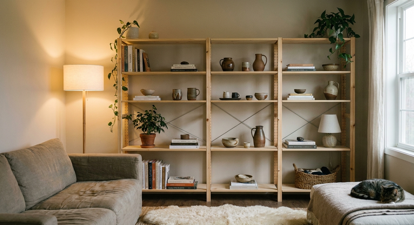
IVAR is one of those IKEA pieces that feels almost too honest. It's raw pine, unapologetically simple, and it practically whispers, “I'm here to hold paint cans.” But with a few thoughtful tweaks, IVAR can read more like a tailored, custom storage wall than a garage shelf. The secret isn't doing more. It's doing the right few things that change the silhouette, the finish, and the lighting.
Below are my favorite IVAR upgrades for a high-end look, plus the unglamorous but important stuff like prep, weight limits, and how to anchor in a rental without losing your security deposit.
Before you hack: what makes it look expensive
If you take nothing else from this article, take these three: prep, finish, and edges.
- Prep: A quick sand and clean is the difference between “DIY” and “did you have this made?” Pine shows every rough edge and stray drip.
- Finish: Raw pine can look unfinished fast. A stain, paint, or even a toned clear coat instantly makes it feel intentional.
- Edges: IVAR’s open sides and visible shelf edges read utilitarian. Wrapping the sides or adding panels gives you that built-in, furniture-grade block silhouette.
Once those are handled, styling becomes the fun part.
Prep: sand first, always
Even raw IVAR benefits from a light sanding. It smooths the surface, softens rough edges, and helps stain or paint go on evenly.
- Quick sanding plan: Start with 120 grit, then finish with 180 to 220 grit. You’re not reshaping anything, just refining.
- Sand with the grain: Pine can look scratched if you rush.
- Clean thoroughly: Vacuum, then wipe with a tack cloth or a slightly damp microfiber cloth. Let it fully dry before priming or staining.
- Watch the knots: Pine knots can bleed through paint over time. If you see prominent knots, spot-seal them before priming (more on that below).
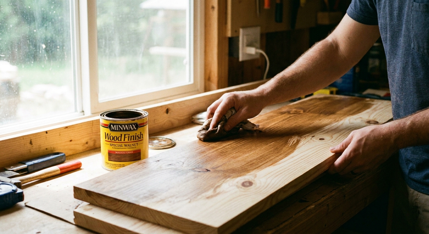
Stain vs paint: what to do with IVAR
IVAR is primarily solid pine across the core system, which is great news because it takes a finish beautifully. That said, some add-ons or components can vary by market or version, so it's worth checking the materials listed for your exact pieces before you commit to a plan.
Whether you stain or paint depends on the vibe you want and how much visual weight you want the piece to have in the room.
When staining looks best
Stain is my go-to when you want the shelf to feel like a vintage find, especially in a space with warm metals, aged wood, or linen-heavy softness. Done right, stained pine looks like a piece that has lived a little, in the best way.
- Pick a tone that suits your floors: If your floors are warm oak, lean warm. If they’re cool or very dark, a mid-tone walnut stain often bridges everything.
- Use a pre-stain conditioner: Pine is notorious for uneven absorption. Conditioner helps avoid that patchy “oops” effect.
- Test on the underside: Stain can shift dramatically once it dries.
My favorite high-end stain look: a mid-tone walnut with a soft matte topcoat. It reads like a calm, collected antique shop moment, not a shiny DIY.
Topcoat tip: If you want the look of wood without the shine, choose a matte or satin water-based polyurethane. If you want a hand-rubbed feel, a hardwax oil can be gorgeous, but follow cure times and be realistic about durability in high-traffic spots.
When painting is the better move
Paint is ideal when you want IVAR to disappear into the architecture and look built-in. It's also a lifesaver if the unit will live in a high-traffic spot where scuffs happen.
- For a built-in effect: paint IVAR the same color as the wall, or one shade darker.
- For a furniture effect: choose a contrasting color with a softer sheen, like eggshell or satin.
- Don't skip primer: A bonding primer helps paint adhere. For pine knots and resin bleed, use a stain-blocking primer (shellac-based is the classic choice) on knots and any problem areas before your main primer.
Designer-leaning color picks: muddy olive, inky blue-black, warm putty, or a gentle mushroom. These hide seams, flatter decor, and feel expensive even when the piece is very affordable.
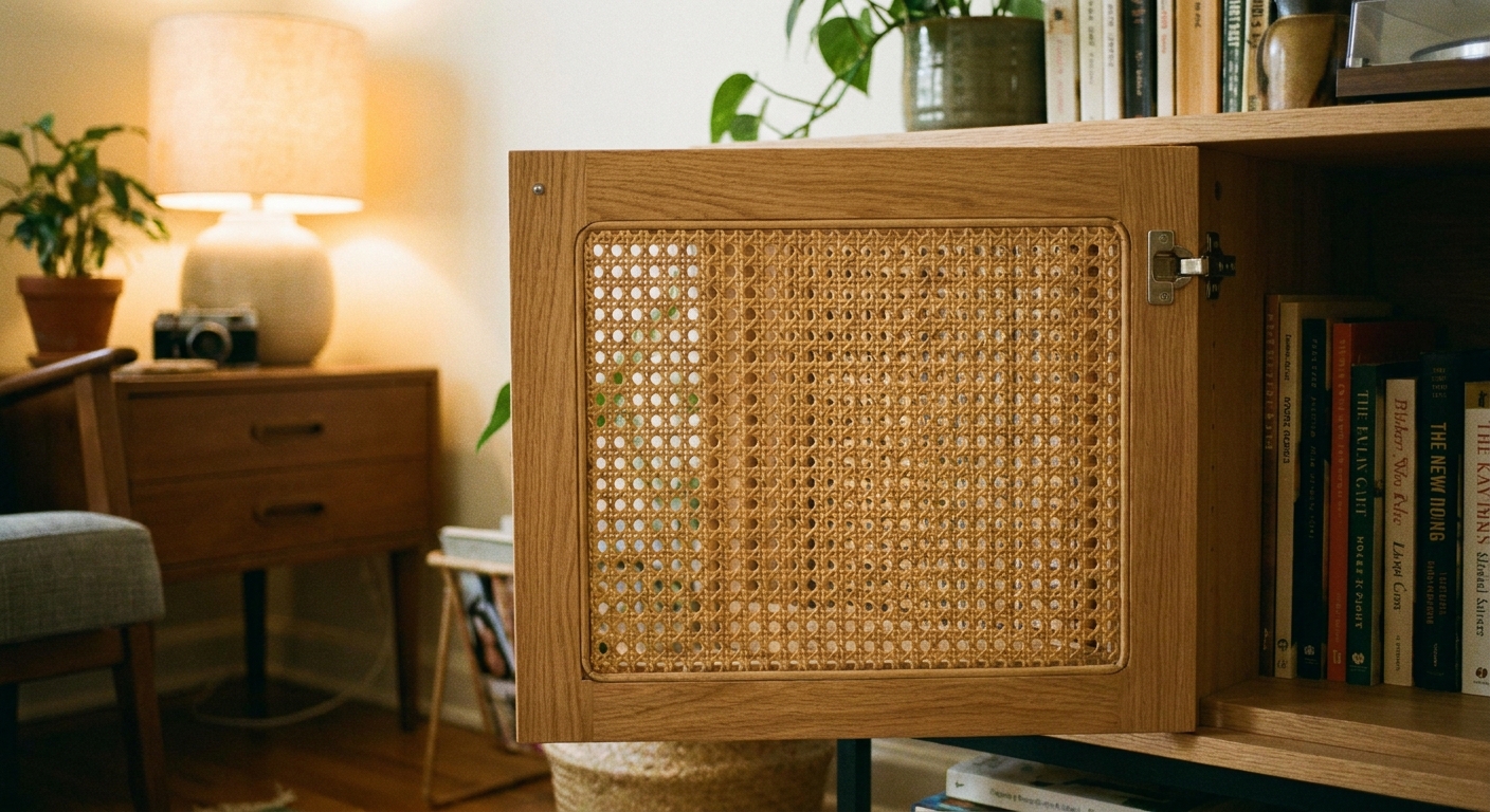
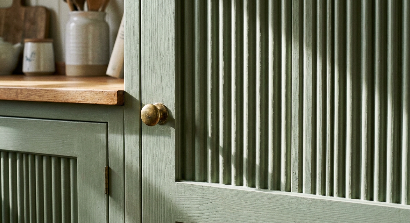
Add cane or fluted panels
Texture is the shortcut to “designer.” If IVAR is feeling a little too open, adding panels creates depth and gives your eye something to land on besides stacks of stuff.
Cane inserts
Cane is my favorite way to make IVAR feel like it belongs next to a vintage lamp and a stack of dog-eared novels. It's lightweight, breathable, and forgiving if your shelves hold not-so-pretty necessities.
- Where to add it: on doors, or as inserts on lower sections so the top shelves can stay open and styled.
- Best visual pairing: warm stain, brass knobs, and a softly glowing lamp nearby.
- Tip: Keep cane away from direct heat vents and very damp areas to prevent warping.
Fluted panels
Fluting gives you that upscale, architectural rhythm you see on custom millwork. Even if the rest of your room is relaxed, a fluted detail adds structure.
- Where to add it: on sliding doors, on drawer fronts, or as a side wrap detail.
- Paint loves fluting: a single color over fluted texture looks especially high-end because light and shadow do the work.
- Keep it calm: If you do fluted panels, let hardware be simple so it doesn't get busy.
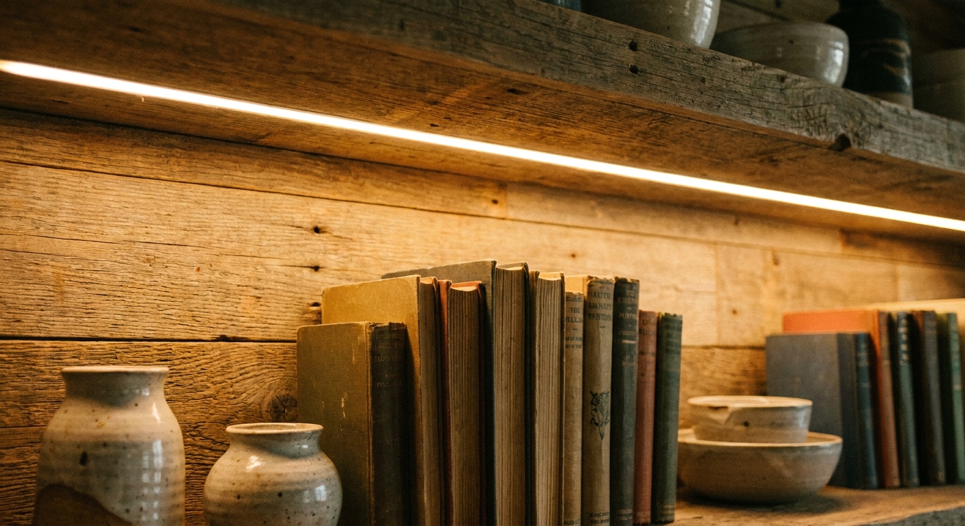
Lighting that feels custom
Lighting is what turns “shelves” into a little scene. It's also what makes IVAR feel intentional at night, when most rooms actually get lived in.
Warm LED strips
- Choose warm white: Look for 2700K to 3000K so it feels like lamplight, not a display case.
- Hide the strip: Mount it under the shelf lip or behind a small trim piece so you see glow, not dots.
- Use a channel if you can: An aluminum channel with a diffuser is the easiest way to eliminate hot spots and make it look built-in.
- Add a dimmer: A dimmer is the difference between “moody built-in” and “interrogation room.”
Make cords disappear
Visible cords are one of the biggest giveaways that something is DIY. Route wiring down the back uprights, use cord covers painted to match, and plan an outlet location before you commit to shelf placement.
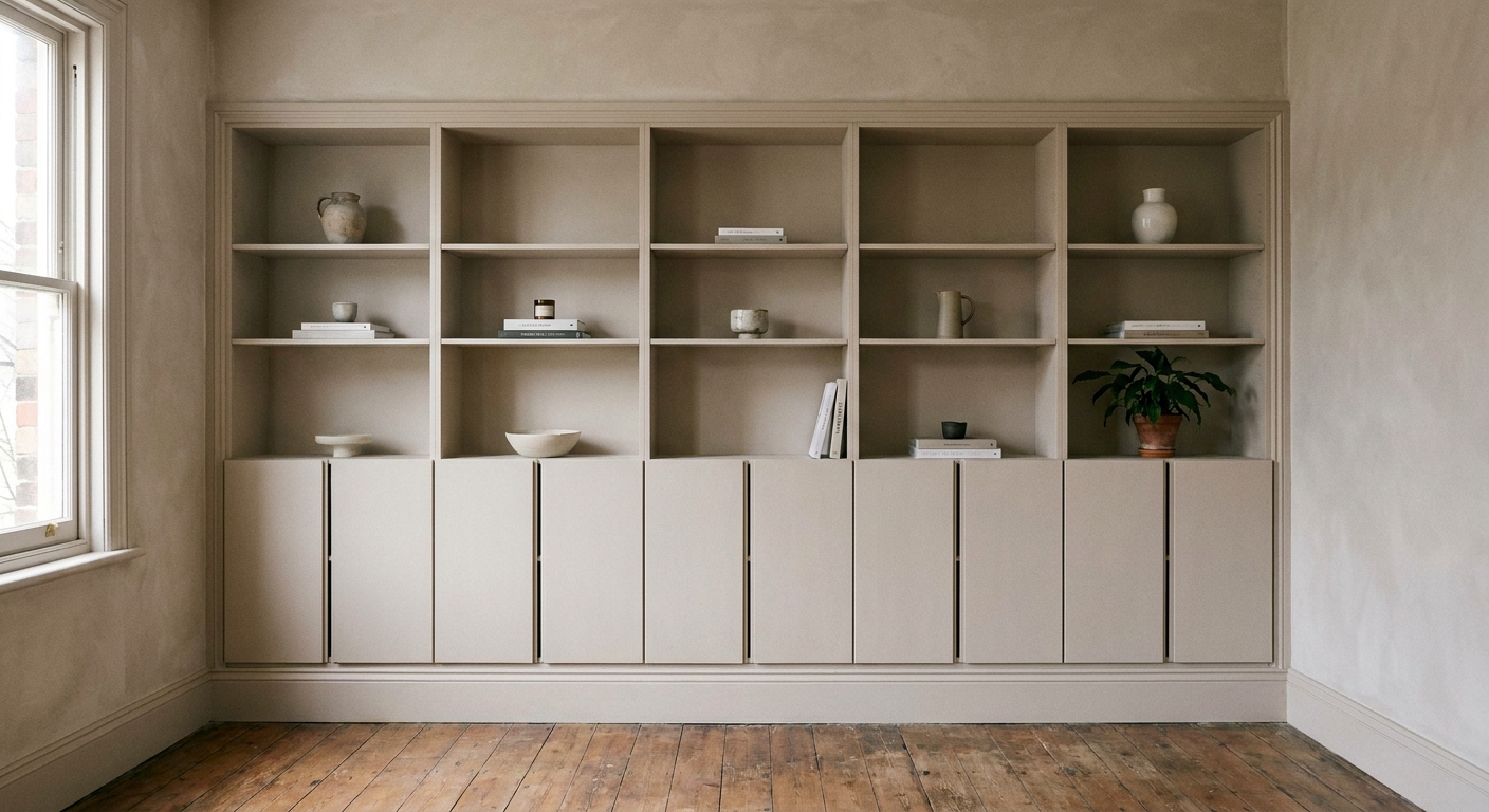
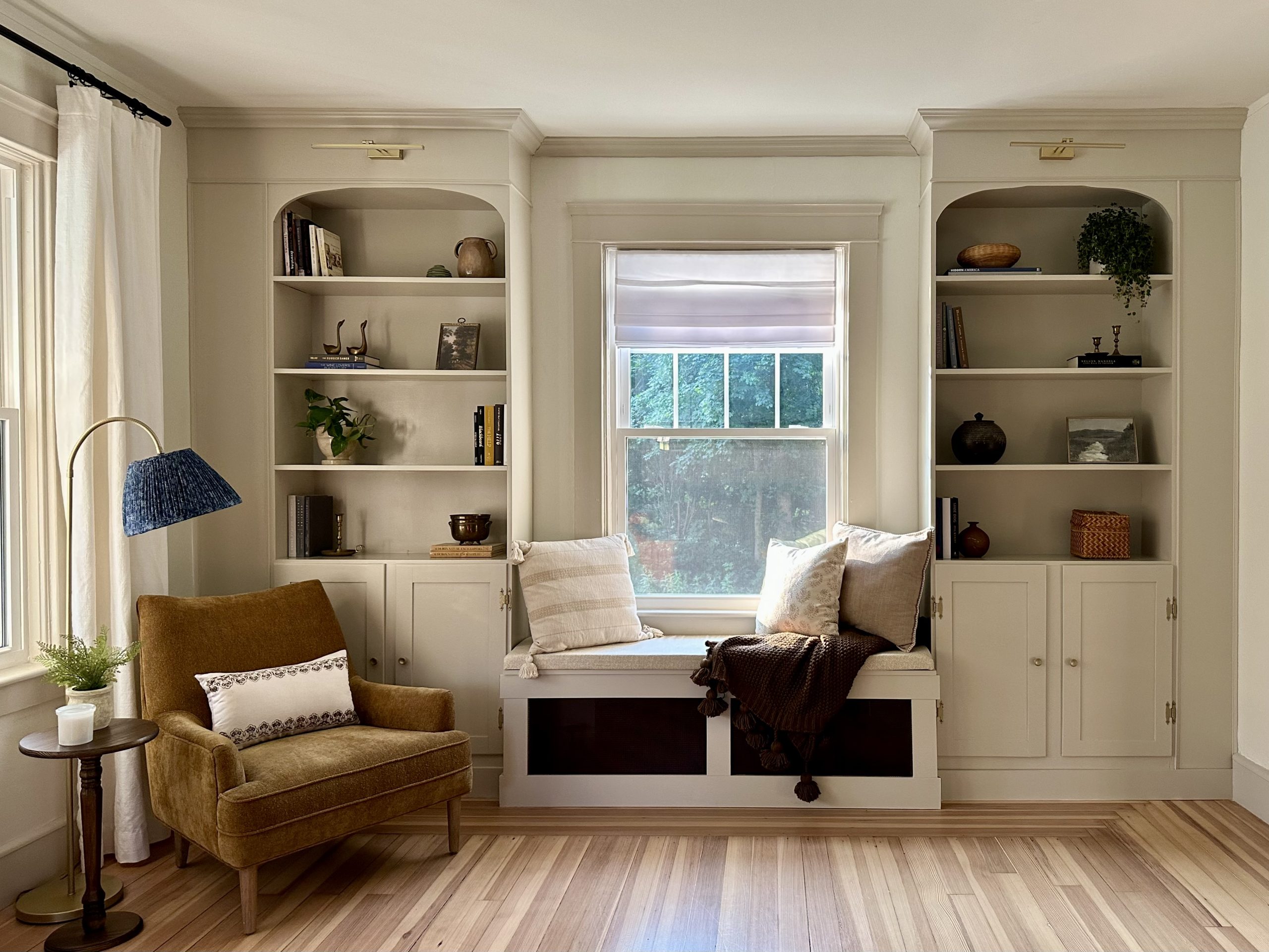
Wrap the sides for a built-in look
If IVAR has one tell, it's the open side profile. Wrapping the sides makes it look like a single, substantial piece instead of a kit of parts. This is the hack that most dramatically changes the vibe.
Option 1: Side panels
Add smooth panels to the left and right sides to create clean “walls” around the shelves. Paint or stain to match the unit. This also gives you a place to hide wiring for lighting.
Option 2: Face frame
A thin face frame around the front edges adds depth and hides shelf seams. Keep it slim and consistent, like a tailored border.
Option 3: Top trim
If your IVAR goes near the ceiling, consider adding a top board or trim detail so it looks designed for the space. Even leaving a small intentional gap and painting the wall behind the same color can look deliberate.
Wood movement note: Pine expands and contracts with humidity. When you add rigid panels or trim, leave tiny, forgiving gaps where needed and avoid over-tightening attachments that could fight seasonal movement.
Hardware and styling
High-end is rarely loud. Once your finish, panels, and lighting are handled, the rest is about restraint.
Hardware upgrades
- Brass or aged bronze pulls: Warm metals instantly soften pine and painted finishes.
- Wood knobs: Great for a Scandinavian, calm, tonal look.
- Consistency matters: Use the same hardware finish across the entire unit.
Styling rules that work
- Leave breathing room: Empty space is part of the styling.
- Vary heights: Stack a few books horizontally, then add something sculptural on top.
- Repeat a material: For example, a brass frame, a brass candleholder, and a brass sconce nearby.
- Hide the chaos: Put bins or closed storage at the bottom where life happens.
Safety and weight notes
Let's talk about the unsexy part. IVAR can be very sturdy when it's assembled correctly, loaded thoughtfully, and anchored. But no shelving system loves being overloaded or left unsecured. Weight capacity varies by component and configuration, so always check IKEA’s current product specs for your specific shelves, cabinets, and dimensions.
- Load depends on span and support: A longer shelf span and fewer support points generally means a lower safe load.
- Distribute weight: Put the heaviest items low and centered. Avoid loading one side heavily.
- Mind sagging: If a shelf bows, reduce the weight and consider adding additional support if your configuration allows it.
- Don't climb: It sounds obvious until you're trying to reach the top shelf with a paintbrush in hand.
If you have kids, pets, or live in an area where bumps and shakes happen, anchoring isn't optional.
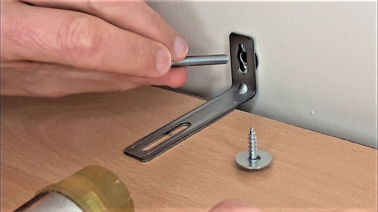
Wall attachment for rentals
IVAR should be anchored to the wall whenever possible, especially if it's tall or top-heavy. In a rental, you can still do this neatly and responsibly.
Best: anchor to studs
Stud anchoring is the most secure. Use appropriate screws and brackets, and keep the unit as flush to the wall as possible so it doesn't pull forward.
If studs don't line up
- Use the right anchor for your wall: Drywall, plaster and lath, and masonry all need different hardware. Match the anti-tip device to your wall type and follow the directions exactly.
- Know the limit: Drywall anchors can help with stability, but they are not a true substitute for studs when it comes to anti-tip safety for tall, top-heavy shelving.
- Add more than one attachment point: Spreading the load is safer than relying on a single spot.
Renter-friendly mindset
Most landlords prefer a couple of neatly patched holes over a toppled bookshelf and a damaged floor. Save the paint color name if you can, patch cleanly when you move, and you're usually in good shape.
Quick hack recipes
Soft vintage apartment
- Walnut stain + matte topcoat
- Cane inserts on the bottom half
- Warm LED strip under one shelf (diffused)
- Aged brass knobs
Modern built-in
- Paint IVAR to match the wall color
- Wrap sides with smooth panels
- Add a slim face frame
- Soft, diffused shelf lighting on a dimmer
Playful and curated
- Paint the back wall behind IVAR a contrasting tone
- Keep shelves mostly open
- Use a few closed bins low
- Repeat one metal finish across decor
Final thought
The most high-end thing you can do to IVAR is make it look like it belongs in your life, not like you copied a showroom. Choose a finish you'll want to touch, add texture that makes you linger, and light it like you light a room you love to come home to. That's the difference between “storage” and “home.”