IKEA Detolf Built-In Hack: Make Display Cabinets Look Custom
Clara Townsend
Clara Townsend is an interior stylist, vintage furniture enthusiast, and the creative voice behind Velvet Abode. With over a decade of experience transforming both cramped city apartments and sprawling fixer-uppers, she believes that a beautiful home is built on personal stories rather than massive budgets. When she isn't hunting for the perfect brass sconce at a local flea market, she can usually be found rearranging her living room for the third time this month.
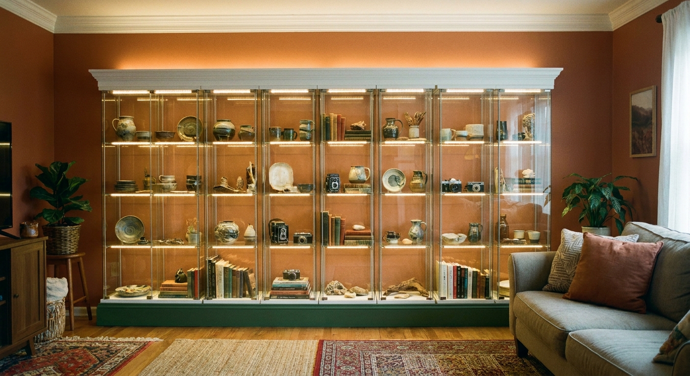
Detolf cabinets are the quiet little workhorses of glass display. Slim profile, lots of vertical storage, and that clean “gallery” feeling that makes even a $12 thrifted vase look important. The only problem is that a row of glass towers can scream temporary if they are floating in space.
This hack is all about making your glass cabinets read like a custom built-in wall. Think: intentional, anchored, softly lit, and finished with trim so it looks like it has always belonged to the room. You can go fully permanent, or do a renter-friendly version that is more “convincing illusion” than construction project.
Before you start
Detolf is tall, narrow, and glass-heavy. That is why it looks so airy, and also why it needs to be treated like a piece of furniture that must be secured if you have kids, pets, or an earthquake-prone zip code.
- Know what you are shopping for. IKEA discontinued the Detolf around 2023/2024. Most Detolfs are now a secondhand find. If you want a current IKEA option with a similar vibe, look at lines like BLÅLIDEN (and other glass-front display cabinets), then adapt the same built-in steps to that cabinet’s dimensions.
- Check the secondhand Detolf situation. If you are buying used, confirm you have all shelves, hardware, and the correct door. Ask about chips, cracked glass, and bent frames.
- Plan for uneven floors. Most homes are not level. Your built-in effect depends on patient leveling, not wishful thinking.
- Decide your finish level. “Trim and paint, looks built-in” versus “full surround with scribed panels.” Both can be beautiful.
Tools and materials
Core tools
- Tape measure
- Stud finder
- Level (a longer one helps)
- Drill and bits
- Driver or screwdriver
- Utility knife
- Caulk gun
Core materials
- Detolf units (or a similar glass cabinet, same color looks most seamless)
- Shims (composite shims are less splintery)
- Furniture straps or anti-tip hardware
- Painter’s tape
- Touch-up paint (wall color and trim color)
Built-in finish materials (choose what fits your space)
- Base platform: 2x4s or 2x3s for framing, plywood/MDF top
- Face trim: 1x2 or 1x3 primed pine, or MDF if you want super smooth paint
- Crown: simple cove or crown molding that matches your home’s vibe
- Filler panels: thin MDF strips for small gaps
- Finish: paint, wood stain, or a peel-and-stick “wood” wrap for renters
Lighting
- LED strip lights (warm white, dimmable if possible)
- Aluminum LED channels with diffusers (optional, but makes it look higher-end)
- Cable raceways to hide cords
- Smart plug or inline dimmer
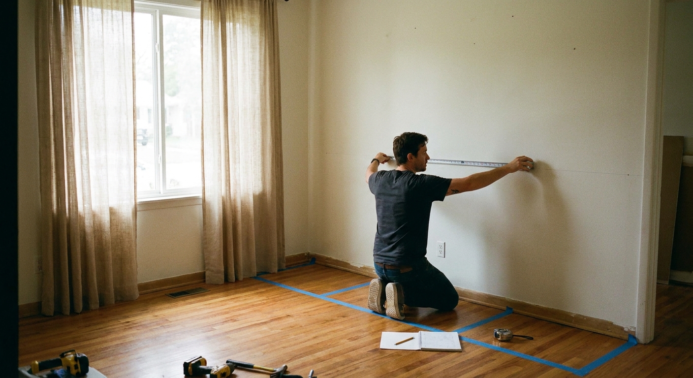
Step 1: Measure like cabinetry
This is where your built-in illusion is made or broken. You are not just checking “do they fit,” you are checking “can they look intentional.”
What to measure
- Wall width at baseboard height and again at about shoulder height. Some walls bow.
- Ceiling height in multiple spots. Old homes love a surprise slope.
- Baseboard depth and any trim that will interfere with the cabinets sitting flush.
- Outlet locations for lighting, and whether cords can route discreetly.
Mock it up with tape
Use painter’s tape on the floor to mark the footprint of each cabinet and the gaps you plan to leave. Stand back. Does it center nicely? Does it avoid looking like you shoved cabinets into the only available corner?
Stylist tip: If your wall width is awkward, consider framing the run with intentional “breathing room” on each side, then finishing those edges with a vertical trim piece. Small, symmetrical margins look custom.
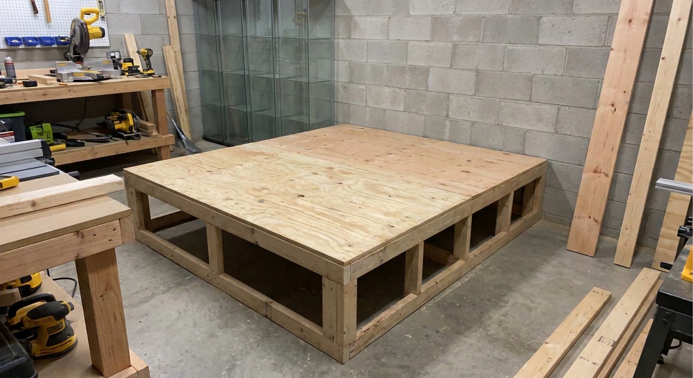
Step 2: Build a base platform
A base platform does three magical things: it makes leveling easier, it visually grounds the glass, and it creates a crisp, furniture-like toe kick that reads built-in.
Simple platform recipe
- Frame a rectangle out of 2x4s that matches the total width of your cabinet run.
- Add cross braces every 16 to 24 inches.
- Top it with plywood or MDF.
- Optional: add a toe-kick set back 2 to 3 inches for that cabinetry feel.
Place the platform where it will live and level it using shims. Take your time. Level front-to-back and side-to-side. Once the platform is solid, your cabinets stop doing that wobbly “are we sure about this?” thing.
Step 3: Assemble and place
Build each cabinet according to the instructions, then move them onto the leveled platform. You want them tight together for a built-in look.
Make the row seamless
- Align the fronts. Use a straightedge or level across the front edges so no cabinet sits slightly forward.
- Clamp gently if needed. If you are comfortable, soft clamps with padding can help pull the line even while you fine-tune spacing.
- Connect units the safe way. Detolfs have glass sides, so you cannot screw through the sides to tie cabinets together. If you want the row to act like one piece, use one of these safer options:
- Top and bottom only: Use small mending plates or corner braces only on the wooden top and bottom caps or bases, pre-drilling carefully and keeping screws short so you do not punch through.
- Frame ties: Use discreet zip ties, wire clips, or small metal clips to pull the internal wire frame sections snugly together (placed where they will not interfere with doors or shelves). Trim ends cleanly so nothing catches.
Note: If you are unsure where it is safe to add connectors, skip it. Focus on perfect leveling and anchoring each cabinet individually. That is what truly removes wobble and makes the whole run feel intentional.
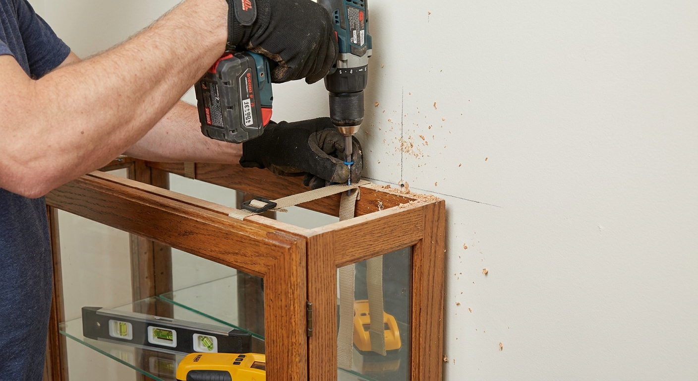
Step 4: Anchor for safety
Even if you do a renter-friendly finish, anchoring is the part I do not like to compromise on. A built-in look is literally “this is part of the wall,” so we want the setup to behave that way.
Best practice anchoring
- Find studs behind each unit if possible.
- Use anti-tip straps or brackets at the top, installed per the hardware instructions.
- If studs do not land where you need them, use appropriate wall anchors for your wall type, but understand they are not equal to studs.
Renter note: Small holes from anti-tip hardware are usually easy to patch. If your lease is strict, ask your landlord. Safety is still worth the conversation.
Step 5: Trim and fillers
This is where the transformation happens. Trim is basically makeup for furniture. It softens seams, adds shadow lines, and makes separate pieces read as one.
Option A: Minimal trim
- Add a simple vertical trim piece on the far left and far right edges of the run.
- Cover any small side gaps with thin MDF filler strips.
- Caulk the trim where it meets the wall for a seamless finish.
Option B: Full surround
- Add vertical “stiles” between cabinets and on the ends.
- Add a top “rail” that runs across the entire span.
- If you have baseboards, decide whether to notch the trim around them or remove and replace baseboard along that section for the cleanest look.
Paint trick: Paint the trim the same color as your wall for a modern, built-in architectural look. Paint it the same color as your room trim for a more traditional, furniture-finish effect.
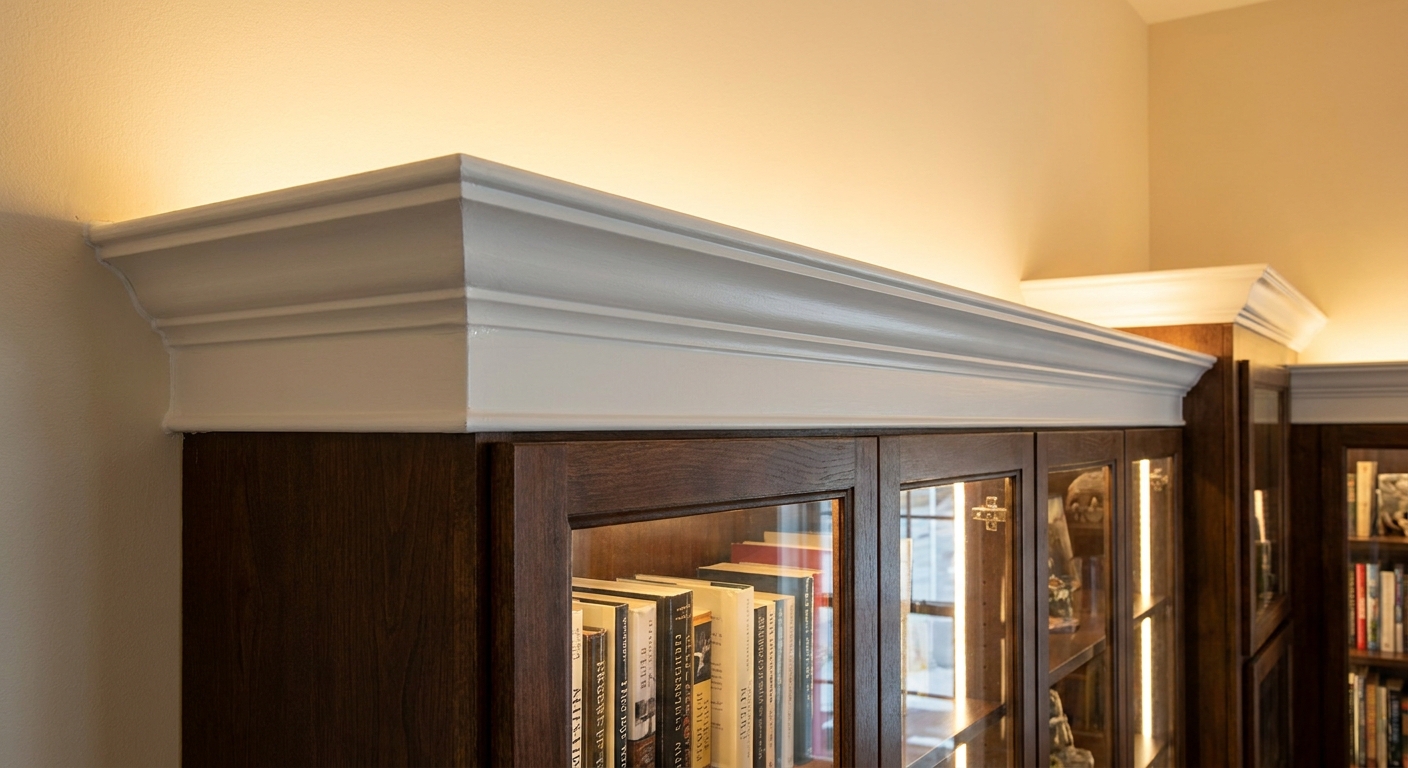
Step 6: Add crown or a cap
That little line at the top is what makes people say, “Wait, was that always there?” Crown is not required, but it is a shortcut to “custom.”
Two easy approaches
- Crown to ceiling: If you have a small gap from the top of the cabinets to the ceiling, build a simple soffit or top frame, then add crown molding to meet the ceiling.
- Top cap only: If going to the ceiling feels like too much, add a clean top board or trim cap that spans the run. It still visually unifies the cabinets.
Design note: In tight rooms, a to-the-ceiling finish can actually look less bulky because it removes the awkward dead space that collects dust and visual clutter.
Step 7: Lighting that looks pricey
These glass cabinets are made for sparkle moments. Lighting is what turns “storage” into “display.” Aim for warm, soft, and even.
My favorite setup
- Warm white LED strips (around 2700K to 3000K) mounted inside an aluminum channel for a clean line of light.
- Run the strip along the front inside edge or along the top, angled slightly inward to avoid glare.
- Hide wires with paintable cable raceways along the wall corner behind the cabinets.
- Add a dimmer or smart plug so you can shift from “museum” to “movie night.”
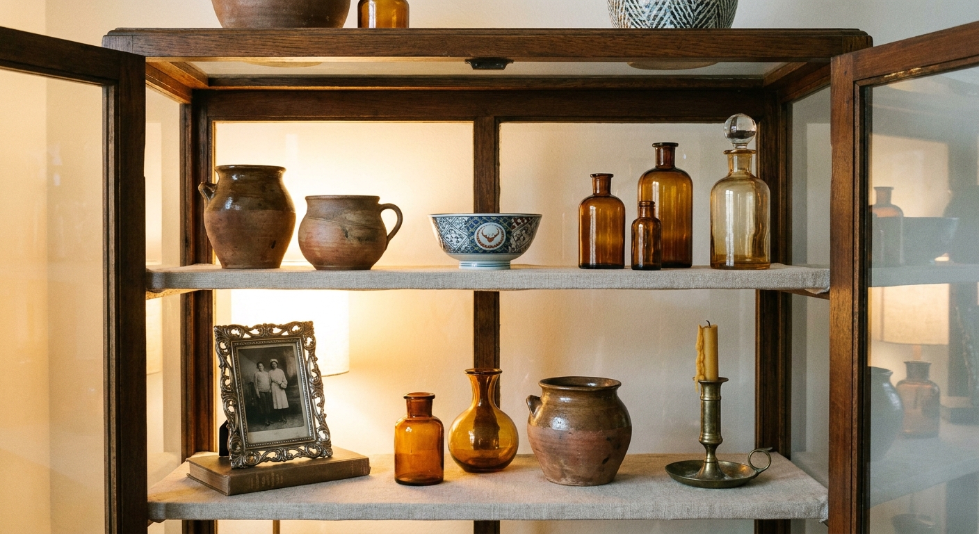
A quick styling rule for lit shelves
Leave a little negative space. Glass already reflects and doubles what is inside, so give each object room to breathe. One sculptural piece plus one smaller supporting piece per shelf often looks more elevated than a packed shelf.

Renter-friendly options
You can get 80 percent of the custom effect without permanently attaching trim to the wall.
Try this approach
- Use a freestanding platform. Level it, but do not fasten it to the floor. The cabinets sit on it and feel grounded.
- Create a removable surround. Build a thin “frame” that attaches to the platform and lightly to the cabinets, not the wall.
- Use peel-and-stick upgrades. A wood-look wrap on the platform or trim can add warmth without paint.
- Anchor with minimal holes. Anti-tip straps create small repairable holes, and they are worth it for safety.
Patch plan: Keep a tiny jar of your wall paint and a small container of spackle in your “moving out” kit. Future you will be grateful.
Common mistakes
- Skipping leveling. If the first cabinet is off, every cabinet after it will look more off. Level the platform, then level each cabinet.
- Leaving random gaps. Small gaps look like you “made it fit.” Symmetry and trim make it look designed.
- Cool-toned lighting. Blue-white LEDs can make your collectibles look clinical. Warm light feels like home.
- Overstuffing shelves. Give your favorite pieces breathing room and vary heights for a calm, curated look.
- Trying to screw cabinets together through glass. Detolf sides are glass. If you connect units, do it only at the top and bottom wood pieces, or use discreet ties on the internal frame.
Styling ideas
Here is where the “Velvet Abode” heart comes in. A built-in should feel like a collection of stories, not a store display.
- Go tonal: cream ceramics, amber glass, and brass for a warm, glowy look.
- Mix eras: mid-century pottery next to a modern photo frame, plus one weird flea market find that makes you smile.
- Add soft backdrops: If you want less visual noise, line the back wall behind the cabinets with removable wallpaper or a painted panel in a moody color.
- Use books sparingly: A small stack under an object adds height and makes it feel intentional.
Quick checklist
- Platform is level and solid
- Cabinets aligned flush in front
- Units secured with anti-tip hardware
- Gaps filled with trim or filler strips
- Trim caulked and painted for a seamless edge
- Lighting installed and cords hidden
- Styling edited down to your best pieces
If you build this and you catch yourself turning the lights on just to walk by and admire your own shelves, that is the whole point. A home should feel like a comforting hug, and sometimes that hug is delivered via a perfectly lit little glass cabinet full of things you love.