How to Mix Wood Tones So Your Room Looks Intentional
Clara Townsend
Clara Townsend is an interior stylist, vintage furniture enthusiast, and the creative voice behind Velvet Abode. With over a decade of experience transforming both cramped city apartments and sprawling fixer-uppers, she believes that a beautiful home is built on personal stories rather than massive budgets. When she isn't hunting for the perfect brass sconce at a local flea market, she can usually be found rearranging her living room for the third time this month.
If mixing wood tones makes you feel like your room is quietly arguing with itself, you are not alone. One chair is honey oak, the coffee table is walnut, the floors are somewhere between “golden” and “orange,” and suddenly you are wondering if you should just paint everything black and call it a day.
Here is the good news: rooms that look collected and calm often have multiple wood tones. The difference is that the mix is guided by a few repeatable choices, not luck. This is the exact approach I use when I am styling a space with thrifted finds, hand-me-downs, and one or two pieces that were definitely not a bargain.
The four core principles
If you remember nothing else, remember these. They work in tiny rentals, old houses with tricky floors, and open-concept rooms where every finish is visible at once.
- Anchor with the largest wood piece.
- Repeat an undertone so it feels intentional.
- Contrast on purpose (skip “almost matching”).
- Bridge with textiles and small accents.
Everything else in this guide is just the practical “how” under those four ideas.
1) Anchor: pick your home base
Your anchor is usually the largest, least-movable wood element. Think: flooring, a big dining table, a wall unit, a bed frame, or a substantial vintage dresser you’d rather not wrestle up the stairs again.
How to choose your anchor
- If you have wood floors: the floor is the anchor, even if you don’t love it yet.
- If floors are not wood (or are hidden by a rug): choose the biggest wood furniture piece in the room.
- If the room is open concept: anchor with the wood you see from the entry point first.
Once you name the anchor, your job shifts from “make everything match” to “make everything relate.” Much easier.
2) Repeat: match undertones, not names
Wood tone is not just light vs dark. The key is undertone, meaning the subtle color direction living underneath the stain or finish. When undertones relate, mixed woods look harmonious even if the shades vary a lot.
One quick caveat that will save you time: finish matters more than species. Walnut can look warm, neutral, or even a little cool depending on stain and lighting. Maple can swing warm (yellow) or go pale and “cool” when it’s bleached or weathered. So use species as a hint, not a rule.
The quick undertone check
Grab something white, like a sheet of printer paper or a white dish towel, and hold it next to the wood in daylight.
- Warm undertones: reads more yellow, orange, red, or amber (many oaks, cherry, teak, and plenty of stained finishes).
- Cool undertones: reads more gray, ashy, or slightly green (some weathered finishes and many “driftwood” stains).
- Neutral undertones: reads more brown without pulling strongly warm or cool (many mid-browns and sealed natural finishes).
Lighting can trick you
Before you decide a wood is “too orange” or “too gray,” check it in daylight if you can. Warm bulbs (like 2700K) can make already-warm floors look extra golden. Cool daylight can make the same floor read calmer. If you’re shopping, snap a photo by a window and again under indoor lighting. If it looks wildly different, you’ll want more bridging (rugs, paint, textiles) to steady it.
3) Repeat: aim for 2 echoes
Here’s the move that makes a room feel styled: once you have your anchor, echo that undertone at least two more times somewhere in the room. That repetition is what reads as design, not accident.
What repeating can look like
- Your anchor is warm oak floors. You add a warm walnut coffee table and a warm-toned wood frame on the gallery wall.
- Your anchor is a cool, weathered dining table. You add cool-toned open shelving and a small side chair with an ash finish.
- Your anchor is a neutral mid-brown dresser. You add a neutral wood tray on the coffee table and neutral wood picture frames.
Notice what I did there: repetition doesn’t have to be big furniture. A frame, tray, bowl, or stool absolutely counts. Very good news if you’re decorating on a real-person budget.
4) Contrast: avoid almost matching
The most awkward wood combinations are not wildly different. They’re the ones that look like they were trying to match and missed by one shade. That “close but not quite” problem is why a room can feel uneasy even when everything is technically nice.
A simple contrast guideline
- If woods are in the same undertone family, you can mix them across different depths (light oak with medium walnut, for example).
- If woods are in different undertone families, make the contrast obviously intentional (very light and cool with very dark and warm, rather than two medium woods that disagree).
Pairings that usually work
- Light natural wood + deep espresso wood (clean, classic, forgiving).
- Warm mid-tone wood + black-stained wood (black acts like a neutral “ink”).
- Weathered gray wood + rich walnut (cozy, lived-in, great with vintage).
If you’re nervous, let your anchor be the comfortable, familiar wood and make your contrast piece the smaller one. Contrast feels boldest when it’s huge.
5) Bridge: rugs, fabric, paint
Bridging is the reason mixed woods can feel like a comforting hug instead of a debate. Rugs, curtains, upholstery, and even wall color create a soft in-between layer that helps your eye glide from one finish to the next.
Bridges that work hard
- Rugs with a blended palette: look for rugs that include at least two of your wood-adjacent colors (cream plus caramel, or taupe plus chocolate).
- Linen and cotton in warm neutrals: oatmeal, sand, camel, and stone soften both warm and cool woods.
- Leather: cognac leather is a particularly good bridge between warm oak and darker woods.
- Paint: wall color changes everything. Warm whites and creamy off-whites calm orange floors. Soft greiges and taupes can help warm and cool woods play nicely together.
Quick note for laminate or LVP floors: the same rules apply, but faux-wood can have a sneaky printed undertone (sometimes a little pink, sometimes a little green). That just means your rug and paint choices do even more heavy lifting. Don’t fight it alone with furniture.
6) Bridge: small accents and sheen
If the big pieces are set, this is where you make the room feel finished. Think of these as little nods that tell your brain, “Yes, this was planned.”
- Wood accents: bowls, trays, cutting boards (kitchens), stools, plant stands.
- Frames: repeat a wood tone on the wall to lift it off the floor plane.
- Hardware: wooden knobs on a painted piece can link it to surrounding woods.
- Plants: not wood, but greenery adds a natural note that helps multiple woods feel at home together.
Also, don’t forget sheen. Glossy orange-toned poly next to a matte, raw-looking wood can clash even if the color is close. If you can’t change finishes, buffer the difference with textiles and matte ceramics, and try to repeat sheen where it’s easy (two satin pieces, for example).
When I style a room with mixed woods, I almost always add one small vintage wood object. A carved bowl, a little box, even a thrifted candlestick. It’s like a friendly handshake between finishes.
If your floors are orange
Orange-toned floors are the most common wood-tone struggle I see, especially in rentals and older homes. You don’t need to fight them. You just need to redirect the conversation.
Try this trio
- Anchor: accept the floor as the warm base.
- Contrast: bring in deeper, richer woods like walnut or espresso so the orange reads more “golden” by comparison.
- Bridge: add a rug with cream, taupe, and a touch of warm brown to calm everything down.
Avoid adding another medium wood that’s warm but slightly different. That’s the “almost matching” trap again. Go lighter and cleaner, or go darker and richer.
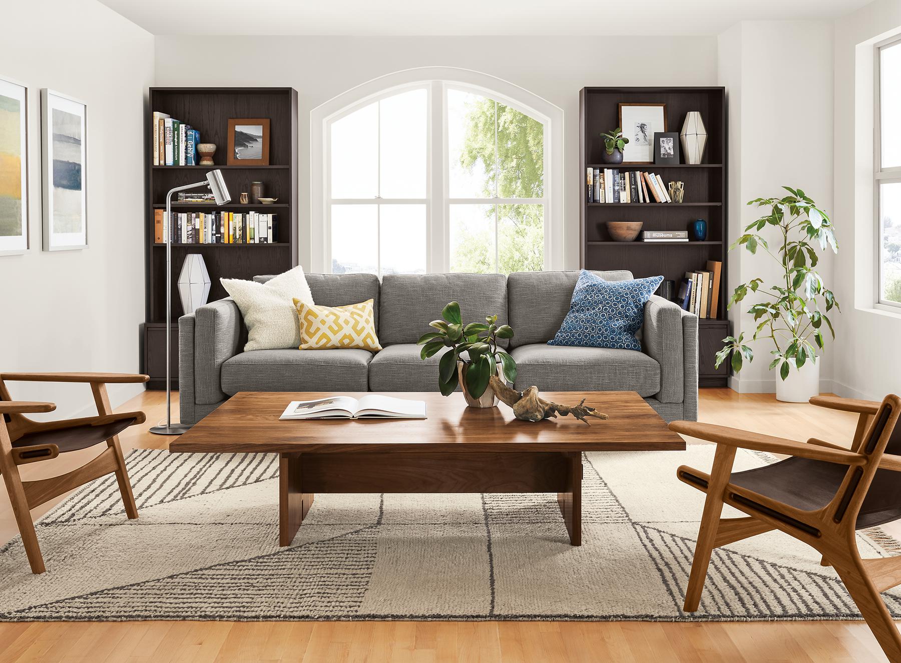
Mini recipe: orange oak floors + gray sofa
- Anchor: orange oak floors (yes, we’re calling it what it is).
- Main wood: walnut or espresso coffee table to deepen the palette.
- Repeat: two warm accents, like a wood frame and a wood tray (both warm, not ashy).
- Bridge: cream and taupe rug, plus oatmeal pillows or a camel throw on the gray sofa.
- Metal: black or aged brass to add crisp structure.
Common mistakes
1) Too many woods, no repetition
Fix: choose your anchor, then pick one secondary undertone to repeat. If you already own everything, repeat with accessories: frames, trays, stools.
2) Everything is the same depth
If all your woods are medium, the room can look flat and a little dated.
Fix: add one very light element (light oak frame, pale wood stool) or one very dark element (espresso side table, black-stained bench).
3) Mixing warm and cool without a bridge
Fix: bring in a “neutralizer” like a creamy rug, taupe upholstery, warm white paint, or black accents. Black and soft off-whites are excellent referees.
4) Forgetting sheen
Fix: repeat sheen where you can and buffer the rest with textiles and matte decor.
Room cheat notes
Living room
- Anchor with the coffee table, media console, or floors.
- Repeat undertone through frames and a side table.
- Bridge with a generous rug and layered lighting.
Dining room
- Anchor with the dining table.
- Chairs don’t need to match, but they should share an undertone or have a consistent bridge material like upholstery.
- A runner and a centerpiece tray can quietly repeat wood tone.
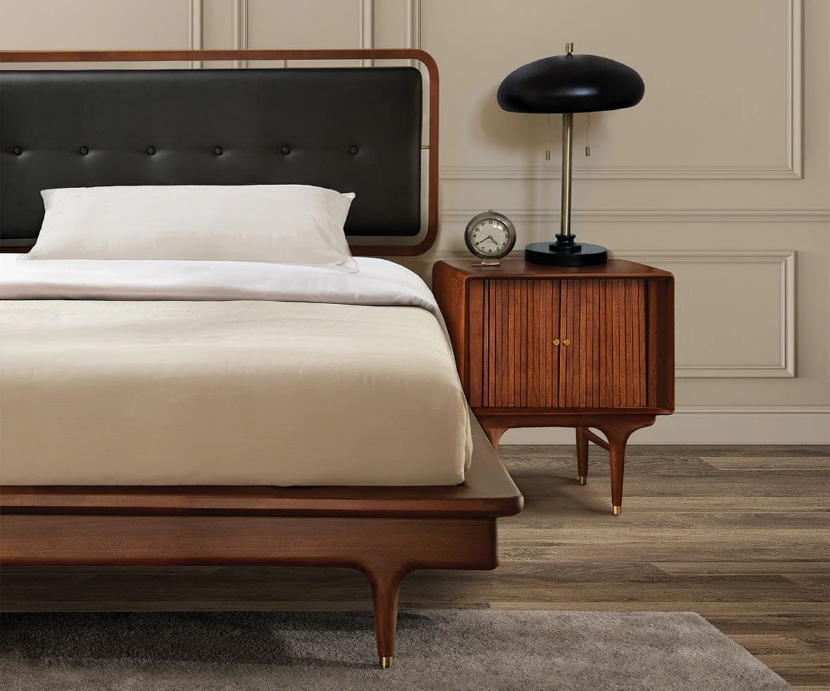
Bedroom
- Anchor with the bed frame or dresser.
- Nightstands are the easiest place to add deliberate contrast.
- Bridge with bedding: linen, quilted cotton, and a warm throw.
Kitchen
- Anchor with cabinets or floors.
- Repeat undertone with cutting boards, stools, or open shelving.
- Use metal finishes to connect zones.
Metal helps
When wood tones feel busy, metals can create a clean visual rhythm. Pick one primary metal finish and repeat it a few times. Think: cabinet pulls, a lamp, a mirror frame, a faucet, or a curtain rod.
- Brass: warms up cool woods and plays beautifully with amber tones.
- Black: crisp, graphic, and great when you have many different woods.
- Nickel or chrome: reads fresh and light, especially with cooler or neutral woods.
I personally love a little aged brass in mixed-wood rooms. It adds glow, and it makes vintage pieces feel like they belong.
Shopping checklist
If you’re building a room piece by piece, this keeps you from bringing home a “maybe” that turns into a “why did I buy this” two weeks later.
- What is my anchor wood?
- Is this piece warm, cool, or neutral? (Check it near something white.)
- Am I echoing an undertone I already have? Or am I introducing a new one?
- Is the contrast obvious and confident? (Light vs dark, not medium vs medium.)
- Do I have a bridge plan? Rug, curtains, upholstery, or paint.
If you can’t answer at least three of those questions in the aisle, take a photo and walk away. The best finds have a way of waiting for you when you’re ready.
Quick FAQ
How many wood tones are too many?
In most rooms, two to four wood tones is the sweet spot. You can go beyond that if undertones are consistent and you have strong repetition, but it gets harder to make it feel calm.
Do all woods need to match the floor?
No. Floors are the anchor, not the dictator. Your goal is relationship, not obedience. Repeating undertones and bridging with textiles is what makes it work.
Can I mix painted furniture with wood tones?
Absolutely. Painted pieces are often the relief a room needs. Just make sure you repeat the wood you do have through a few accents so the natural finishes still feel intentional.
The takeaway
Mixing wood tones isn’t about picking the “right” finish. It’s about creating a little rhythm: anchor, repeat, contrast, bridge. Once you do that, your room stops looking like a showroom set and starts looking like a home with stories. The best kind.
If you want a tiny action step today: identify your anchor wood, then add two small objects that echo its undertone. A frame and a tray. A thrifted bowl and a set of wood hangers. Small moves, big calm.