Dining Room Paint Colors by Mood
Clara Townsend
Clara Townsend is an interior stylist, vintage furniture enthusiast, and the creative voice behind Velvet Abode. With over a decade of experience transforming both cramped city apartments and sprawling fixer-uppers, she believes that a beautiful home is built on personal stories rather than massive budgets. When she isn't hunting for the perfect brass sconce at a local flea market, she can usually be found rearranging her living room for the third time this month.
The dining room is one of the few spaces where we ask a lot from a single set of walls. On Tuesday it’s cereal and backpacks. On Saturday it’s a slow roast, a playlist, and the kind of conversation that keeps you lingering long after dessert.
If you’ve ever painted a color you loved on a swatch, only to feel oddly tense or washed out at night, you’re not imagining it. Dining rooms can be extra revealing because many of us experience them under warm evening light, next to food, wood tones, and reflective glassware.
This guide helps you choose a dining room paint color based on the mood you want when you pull out the good napkins.
Start with the feeling
Before we talk color families, decide what you want the room to do for you. I like to ask clients one question: How do you want people to behave in this room?
- Linger and soften (slow dinners, candlelight, deep chats)
- Laugh and move (family-style, game nights, lots of traffic)
- Reset and brighten (breakfasts, homework, plants, daytime use)
- Feel dressed up (holiday hosting, cocktails, a little drama)
Once you’ve got the mood, paint becomes less of a guessing game and more like styling. You’re building a backdrop for your life.
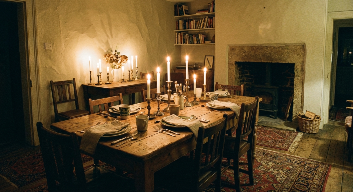
Mood 1: Cozy and candlelit
If your ideal dinner involves low lighting, bread on the table, and a “stay for one more glass” vibe, reach for colors that hold warmth at night. Think warm undertones (not stark, blue-based neutrals). Warm mid-tones and deeper shades keep faces flattering and make a room feel gently wrapped.
Best paint directions
- Warm taupe and mushroom: grounded, grown-up, and forgiving with wood furniture
- Deep olive and moss: moody without going gloomy, gorgeous with brass and natural linen
- Chocolate and cocoa browns: surprisingly inviting, especially with creamy trim
- Terracotta and clay: the “everyone looks sun-kissed” trick, especially under warm bulbs
Styling notes
- Pick bulbs around 2700K to 3000K for a warm, welcoming glow. If you want a slightly cleaner look on food, lean closer to 3000K.
- Choose high quality bulbs (CRI 90+). It’s one of the biggest upgrades for how paint, skin tones, and food actually read at the table.
- Layer in texture: linen runners, a nubby rug, matte ceramics. Deep colors love tactile contrast.
- If your table is very dark, choose a wall color with a whisper of contrast so the furniture doesn’t disappear.
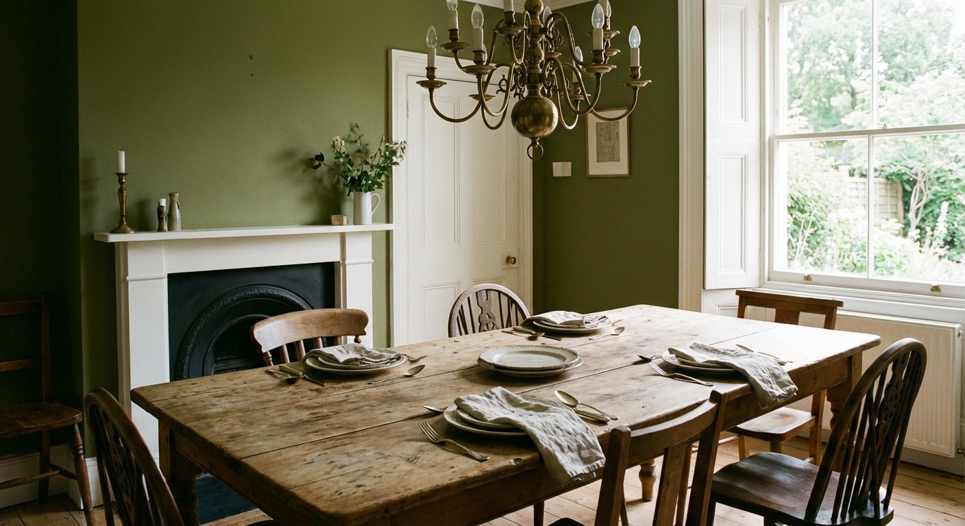
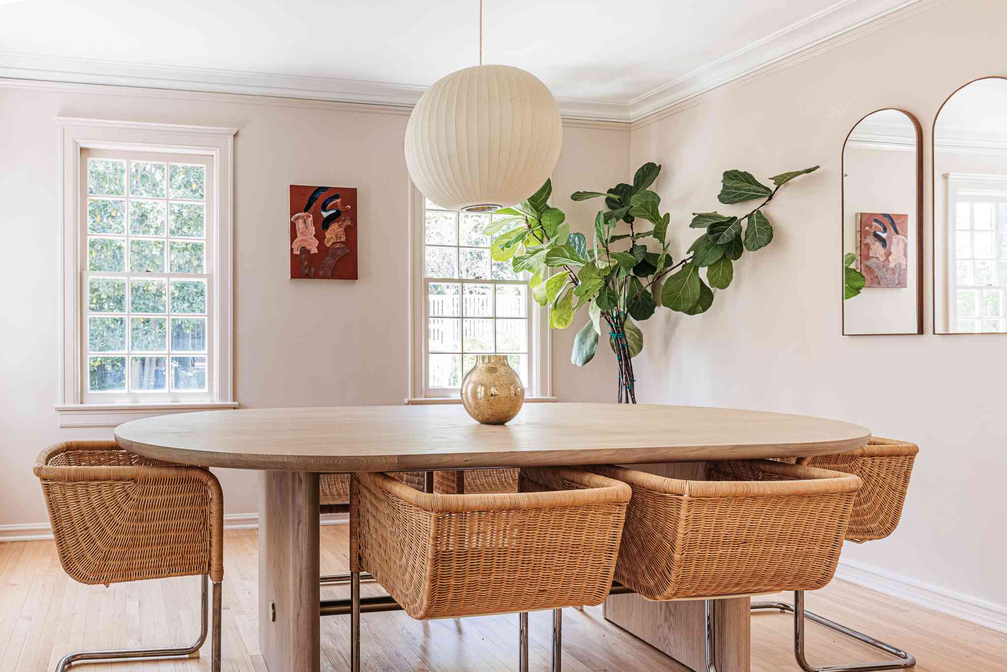
Mood 2: Bright and everyday
If your dining room does double duty as a sunny breakfast spot or a homework station, you want paint that bounces light without feeling icy. The secret is choosing a light color with the right undertone for your floors and the direction your windows face.
Best paint directions
- Soft creamy whites: warmer than stark white, friendly with oak and walnut
- Light greige: calm and flexible when you mix modern chairs with a vintage table
- Powdery blue-grays: fresh in daytime, still composed at night
- Pale sage: airy but grounding, especially with rattan or cane
Undertone check
- North-facing light reads cooler. Choose creamy, warm-leaning whites and greiges.
- South-facing light is generous. You can handle cooler tones without them going flat.
- East-facing light is warm in the morning, cooler later. Avoid overly yellow paint.
- West-facing light glows late day. Many beiges get extra golden, so test carefully.
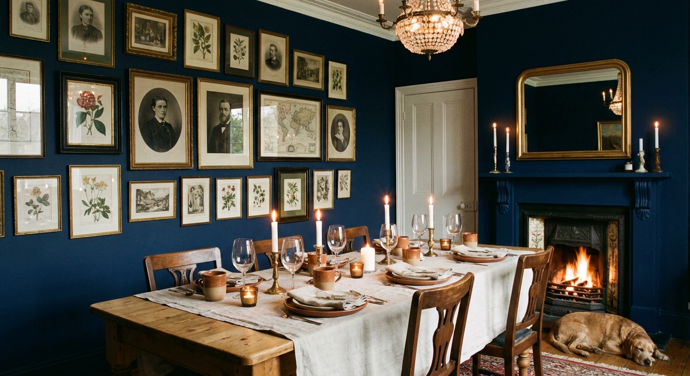
Mood 3: Dramatic and dressed up
If you want a dining room that feels like putting on a favorite outfit, go deeper. Dark paint isn’t “too much” when the room has intention. It can make a basic builder chandelier look expensive and it makes candlelight feel like a scene.
Best paint directions
- Inky navy: classic, sharp with white trim, stunning with warm wood
- Charcoal with a warm base: modern and velvety, less harsh than true black
- Oxblood and burgundy: rich, romantic, and surprisingly timeless with vintage art
- Forest green: a heritage look that plays well with brass and marble
Make it feel intentional
- Use a soft sheen (eggshell or satin) for gentle light movement, especially in smaller rooms.
- Bring in reflectors: an antique mirror, glossy ceramic, glass-front hutch.
- Keep your ceiling lighter if you want height, or match it to the walls if you want a cocoon.
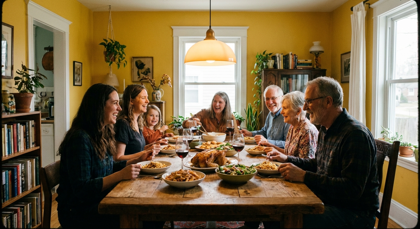
Mood 4: Energetic and sociable
Some homes are naturally loud in the best way. Kids popping in, friends hovering in the doorway, someone always reaching for seconds. If that’s your entertaining style, choose color that feels friendly and alive.
Best paint directions
- Buttery yellow: optimistic, great with white trim and dark woods, flattering for skin tones
- Warm peach and apricot: cheerful without feeling like a nursery when kept slightly muted
- Spiced coral: playful with modern art, surprisingly chic with vintage pieces
- Muted teal: energetic but grounded, especially with warm metals
A helpful guardrail
With brighter colors, I prefer slightly dusty versions instead of neon-clean pigments. They age better and they feel more “home” than “set.”
Food, faces, and lighting
This is the part nobody tells you when you’re standing in the paint aisle: dining rooms are basically a stage set for skin tones and whatever’s on the plate. And because most dining happens under artificial light, your bulb choice matters as much as the paint.
- Very cool grays can make food feel less appetizing and faces a little tired under warm bulbs. This isn’t a hard rule, but it’s common, especially with lower-CRI lighting.
- Green-leaning neutrals look gorgeous with plants and wood, but a strong green cast can make white plates look slightly dull in certain light.
- Warm neutrals and reds tend to be forgiving for people and food at night, especially with warm, high-CRI bulbs.
Rule of thumb: test your finalists under the lighting you actually use (and ideally with CRI 90+). Paint doesn’t live in daylight only, no matter what the swatch pretends.
Walls, trim, and ceiling
Once you choose a mood color, decide how you want the rest of the room to support it.
Option A: Classic contrast
Deeper walls with crisp, light trim. This feels tailored and timeless and it makes vintage pieces look extra special.
Option B: Soft wrap
Walls and trim in the same color, sometimes with trim one step lighter. This reads calm and modern and it can hide imperfect trim lines in older homes.
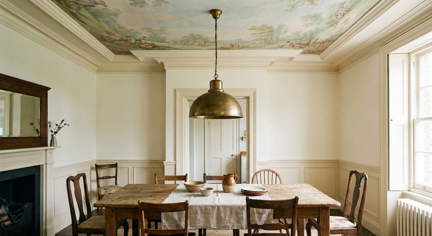
Option C: Statement ceiling
If your dining room has basic architecture but you want drama, paint the ceiling. It’s a surprisingly affordable way to make the room feel designed.
Finish matters
Color gets the glory, but finish is what you live with.
- Matte: soft, cozy, low glare. Best if your walls are smooth and you don’t need to wipe them constantly.
- Eggshell: my go-to for most dining rooms. It’s still gentle, but more forgiving and cleanable.
- Satin: a little more shine, a little more durability. Great for busy households or high-touch areas, but it can highlight wall texture.
Open concept tip
If your dining room flows into the kitchen or living area, you don’t have to paint everything the same color. You just want the undertones to get along.
- Keep a shared neutral running through the space (trim color, ceiling white, or a common warm or cool base).
- If you go bold in the dining room, echo it once nearby, like in art, textiles, or bar stools.
- When in doubt, choose one “hero” room and let the others be supporting characters.
Example palettes
- Cozy: warm taupe walls + creamy trim + aged brass + walnut table + linen
- Bright: soft creamy white walls + pale sage accents + oak + black metal details
- Dramatic: inky navy walls + warm white trim + brass chandelier + vintage art + amber glass
- Social: dusty apricot walls + warm white ceiling + mixed wood chairs + bold, modern art
Testing routine
Paint testing isn’t glamorous, but it saves you from the “why does this look green at night?” spiral.
- Choose 3 to 5 contenders in the same mood family.
- Paint large swatches on poster board (at least 18 x 24 inches) and move them around the room.
- Check day and night (and with candles if you use them).
- Hold the swatch next to your permanent items: floor, table, rug, and any big art.
- Live with it for two days. If you keep thinking about one color, that’s usually your answer.
One more tip from a serial room rearranger: pick your paint after you decide what you want the room to feel like, but before you buy new decor. Paint is the backdrop. Let it do some of the heavy lifting.
Mood to color cheat sheet
- Cozy and candlelit: warm taupe, deep olive, clay, cocoa
- Bright and everyday: creamy white, light greige, pale sage, soft blue-gray
- Dramatic and dressed up: navy, charcoal, forest green, burgundy
- Energetic and social: muted yellow, apricot, dusty coral, teal
Whichever direction you choose, remember this rule of thumb: a beautiful room isn’t a price tag, it’s a story. If a color makes you want to light a candle, set out real napkins, and call a friend, it’s the right color.