Ceiling Paint Tricks for Low Ceilings
Clara Townsend
Clara Townsend is an interior stylist, vintage furniture enthusiast, and the creative voice behind Velvet Abode. With over a decade of experience transforming both cramped city apartments and sprawling fixer-uppers, she believes that a beautiful home is built on personal stories rather than massive budgets. When she isn't hunting for the perfect brass sconce at a local flea market, she can usually be found rearranging her living room for the third time this month.
Low ceilings can make even the prettiest room feel a little… compressed. The good news is that paint is one of the fastest ways to change how your eye reads height, and you do not need fancy molding or major renovations to get there. Think of this as gentle optical styling: a few smart choices that pull the ceiling up and let the room breathe.
Below are my favorite ceiling paint tricks, plus the mistakes I see all the time that quietly lower a room.
Start with sheen: the quickest way to change height
Sheen is the finish of the paint, and it changes how light moves around a room. In a low-ceiling space, you are trying to bounce light upward without drawing attention to every little ripple or patch in the drywall.
My go-to: flat or matte for most ceilings
Flat or matte ceilings tend to feel calm and seamless, which helps the ceiling visually recede. They also hide imperfections better than anything else. If your ceiling has any texture, patched areas, or less-than-perfect joints, flat is usually your best friend.
When eggshell or satin can help (and when it hurts)
Eggshell or satin can make a ceiling feel brighter because it reflects more light. This can work beautifully in a room that is very dark or has a lot of shadowy corners. The tradeoff is that higher sheen shows ceiling flaws, and it can create glare or flashing (those uneven shiny patches) that calls attention to the ceiling plane.
- Use a slightly higher sheen only if the ceiling is very smooth, you want a gentle lift, and you can apply it carefully (steady roller technique, keep a wet edge, or spray).
- Avoid higher sheen in older homes with wavy plaster or patched drywall. You will notice every bump and blend line.
A simple rule
If you can see ceiling imperfections in daylight before painting, choose flat. If the ceiling is smooth but the room feels cave-like, consider matte first and only move up to eggshell if you test it and love it.
Color strategies that make the ceiling float
Color is where the magic happens. Your goal is to reduce contrast at the top of the room and encourage your eye to travel upward without hitting a hard stopping point.
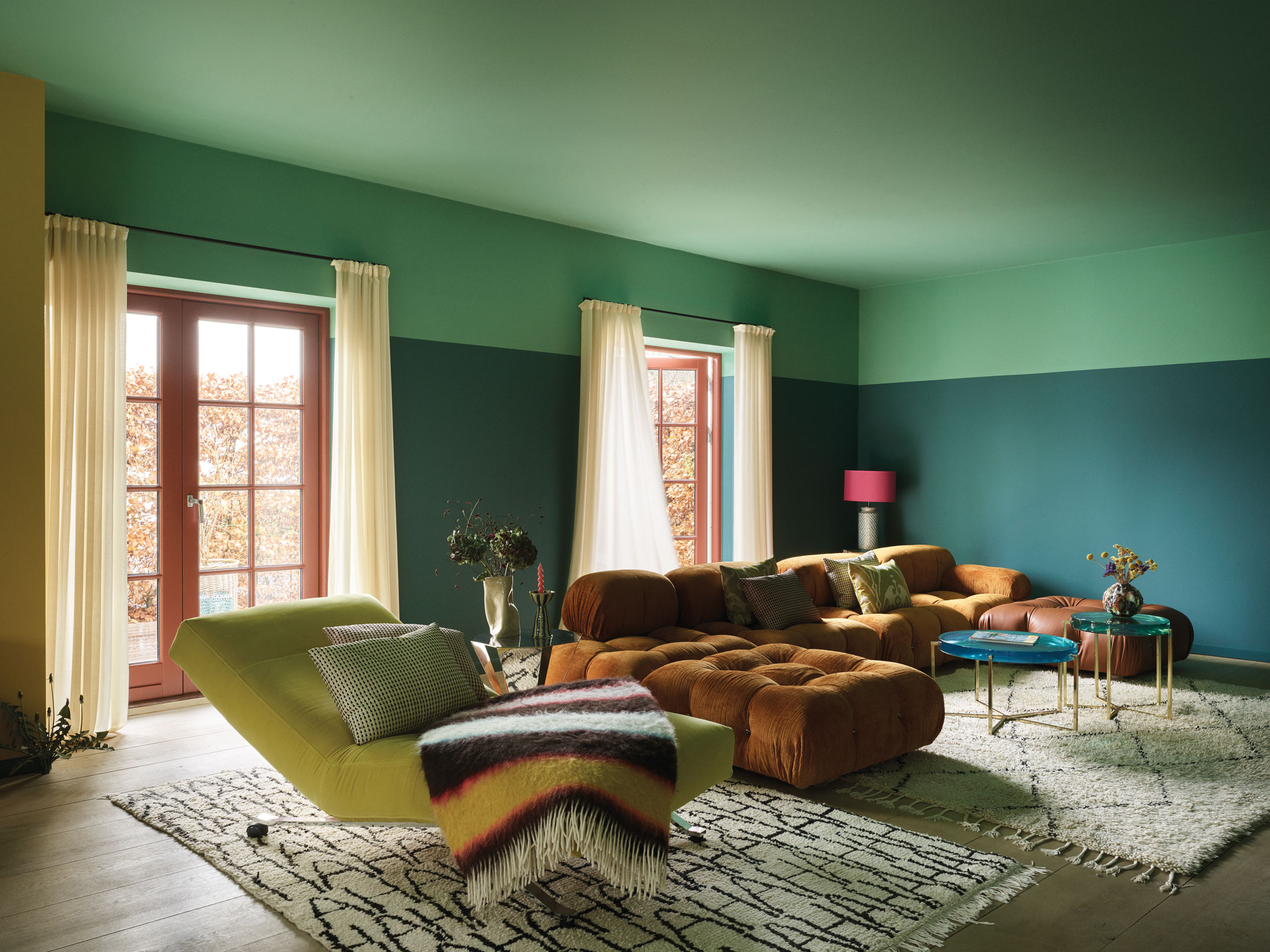
1) Paint the ceiling a softer version of the wall color
This is one of my favorite tricks because it feels intentional and modern, not like a design hack. Choose the same color family as your walls, then go one to two shades lighter on the ceiling. The edges blur slightly, and the ceiling can feel farther away.
- Best for: cozy rooms, bedrooms, small living rooms, rentals with standard white trim.
- Why it works: less contrast at the ceiling line equals less visual weight.
2) Use a warm off-white instead of a bright, icy white
Bright white ceilings can look crisp, but in a low room they can also read like a flat lid, especially next to warmer walls. A creamy off-white often reads less “lid-like” because it blends more naturally with most wall colors and lighting.
In practical terms, think: white that looks good next to linen, not white that looks like printer paper.
Quick note: many “ceiling whites” are tinted slightly cool to fight yellowing. If you are aiming warm, test your sample under your actual bulbs so it does not turn unexpectedly gray or yellow at night.
3) Go monochrome: walls, trim, and ceiling in one tone
Yes, really. Painting walls, trim, and ceiling the same color can make a low room feel taller because your eye stops looking for boundaries. It is especially stunning in hallways, powder rooms, and small bedrooms.
- Best for: rooms with lots of fussy trim or chopped-up wall planes.
- Pro tip: use different sheens in the same color (matte walls, satin trim) if you want subtle structure without hard contrast.
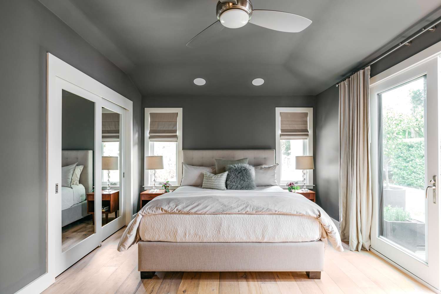
4) If you want a dramatic ceiling, keep it moody and matte
A darker ceiling can feel like it is lowering the room, but in certain spaces it can create depth and a cocoon-like calm. If you go dark, choose matte and keep the transition gentle by using mid-tone or deeper walls. The mistake is pairing a dark ceiling with very light walls and bright white trim, which outlines the ceiling like a box.
Trim decisions: should you paint it the same color?
Trim is the frame around your room. In low spaces, the wrong frame can chop the walls shorter.
Option A: paint trim the same color as the walls
This is the cleanest way to make walls feel taller. When baseboards and casings blend in, your wall color becomes one uninterrupted vertical plane.
- Best for: low ceilings, lots of doorways, busy layouts.
- Bonus: it makes mismatched trim styles look more cohesive.
Option B: paint trim the same color as the ceiling
If you have crown molding (or even a simple top trim detail), painting it to match the ceiling can make the ceiling edge feel less defined, which can visually lift the room.
- Best for: rooms with crown molding, or where the top edge feels visually heavy.
- Watch out: if your trim is very chunky, matching it to the ceiling can sometimes emphasize how low it sits. Test a small area first.
Quick decision rule: if your goal is “taller walls,” match trim to the walls. If your goal is “softer ceiling edge,” match crown and top trim to the ceiling.
Option C: keep trim lighter than walls, but soften the contrast
If you love classic contrasting trim, keep it, just reduce the starkness. Choose a trim color that is creamy and gentle instead of bright white, and avoid going too glossy in a room that already feels tight.
Little paint illusions that add height fast
These are the simple styling moves I reach for when a room feels squat and I want a subtle lift without redesigning everything.
Bring the ceiling color slightly down the wall
Carry the ceiling color slightly down onto the wall by 1 to 3 inches. It sounds backwards, but it blurs the edge and makes the ceiling feel higher because your eye cannot find the exact stopping point.
- Best for: rooms with uneven ceiling lines or older plaster.
- How to do it: use painter’s tape to create a clean, level band, or freehand it for an old-house soft edge.
- Test first: results vary. If your ceiling color is much darker than your wall color, this trick can read like it lowers the room instead of lifting it.
Use vertical color, not horizontal breaks
Anything that creates a strong horizontal stripe, like a chair rail with high contrast paint above and below, can visually slice the room shorter. If you want two-tone walls, keep the division low and subtle, or choose close tones.
Make the top third lighter
If you cannot repaint everything, a gentle trick is to keep the upper portion of the room lighter. Light bounces, shadows retreat, and suddenly the ceiling does not feel like it is hovering right above your head.
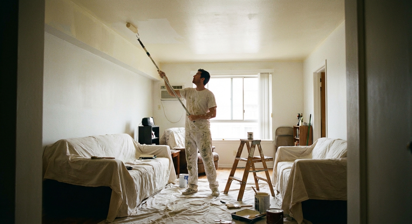
Quick prep and pro application tips
Ceilings are unforgiving, and a little prep prevents the most common issue: flashing (those random dull and shiny patches).
- Block stains first: if you have water marks, smoke residue, or old rings, spot-prime with a stain-blocking primer so they do not bleed through.
- Sand patches smooth: even small repairs can telegraph on a ceiling. A light sand helps the finish look even.
- Use the right roller: 3/8 inch nap for smooth ceilings, 1/2 inch for light texture. Too much nap can add stipple; too little can skip.
- Keep a wet edge: work in sections and do not over-roll as it dries. That is a common cause of lap marks.
- Paint with the light: finish your final passes in the direction of the main window light to minimize visible roller lines.
Common mistakes that make ceilings feel lower
If you only take one thing from this article, let it be this: most low-ceiling problems come from strong contrast and busy boundaries.
- Using stark bright white on the ceiling with saturated walls: the edge becomes a hard outline, like a lid.
- High-gloss ceilings: glare highlights every bump and can make the ceiling feel closer.
- Dark, high-contrast crown molding: it draws a bold line right where you want softness.
- Horizontal stripes or sharp two-tone breaks: they visually cut wall height.
- Skipping ceiling prep: stains, patched spots, and flashing (uneven sheen) grab attention upward for the wrong reasons.
Also, lighting matters. If your ceiling is painted beautifully but your only light source is a harsh overhead fixture, the room can still feel tight. A couple of warm lamps and a soft glow can do a surprising amount of visual lifting.
A quick pick-your-strategy cheat sheet
If decision fatigue is creeping in, here is a simple way to choose.
- Want the easiest win: ceiling in flat warm off-white, walls in a light to mid neutral, trim softened (not bright white).
- Want maximum height: walls and trim the same color, ceiling one shade lighter in the same family.
- Want modern and cozy: walls, trim, and ceiling all one color in matte, then add texture with linen, wood, and vintage metals.
- Want drama without shrinking: deeper walls, matte ceiling in a related tone, minimal contrast at the top edge.
My last tip: test in the real light you live in
Ceilings are sneaky. A paint color that looks perfect at noon can turn gray at dusk or go yellow under warm bulbs. Paint a sample on the ceiling near a window and one in a darker corner, then check it morning, afternoon, and night. If it disappears a little, you are on the right track.
And if you want, tell me your wall color and whether your trim is currently white or wood tone. I can suggest a ceiling approach that will feel taller without losing the personality of your space.