5 Outdated Home Decor Trends to Ditch (And What to Try Instead)
Clara Townsend
Clara Townsend is an interior stylist, vintage furniture enthusiast, and the creative voice behind Velvet Abode. With over a decade of experience transforming both cramped city apartments and sprawling fixer-uppers, she believes that a beautiful home is built on personal stories rather than massive budgets. When she isn't hunting for the perfect brass sconce at a local flea market, she can usually be found rearranging her living room for the third time this month.
Trends are funny. One day, you are proudly pinning glossy photos of a perfectly staged room, and the next, your own living room starts to feel a little… flat. If your space is giving you that restless, itchy feeling (the same one that makes me rearrange my sofa at 9 p.m.), it might not be your taste at all. It might just be a few once-everywhere choices holding your home back.
Below are five home decor trends that, according to recent design coverage and what many people are doing in real homes, are starting to feel a bit dated in a lot of spaces. Plus what to try instead. Nothing here requires a full renovation or a designer budget. Think of it as a gentle edit, like switching from overhead fluorescents to an amber lamp and instantly feeling your shoulders drop.
Note: Trends vary by region, home style, and whether you rent or own. Keep what you love. The goal is not to toss perfectly good pieces, it is to make them work harder for you.
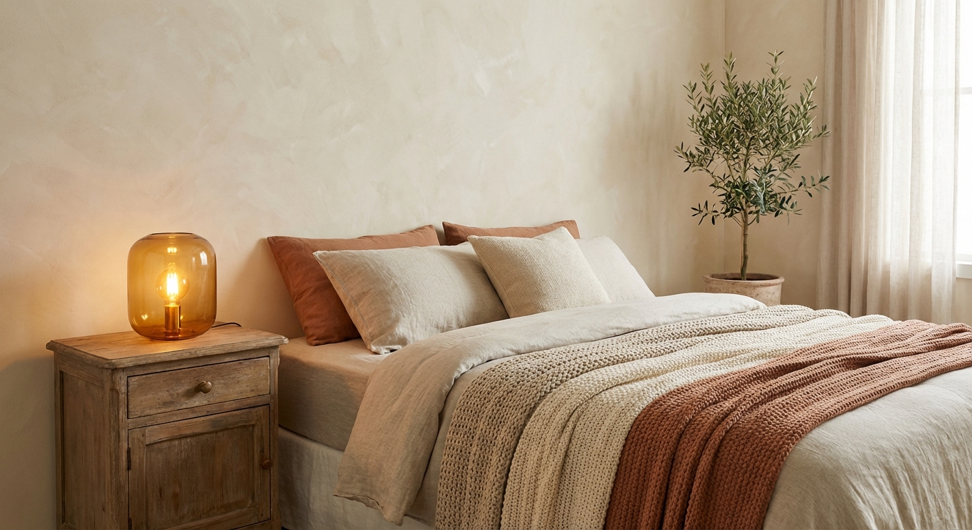
1) All-gray everything
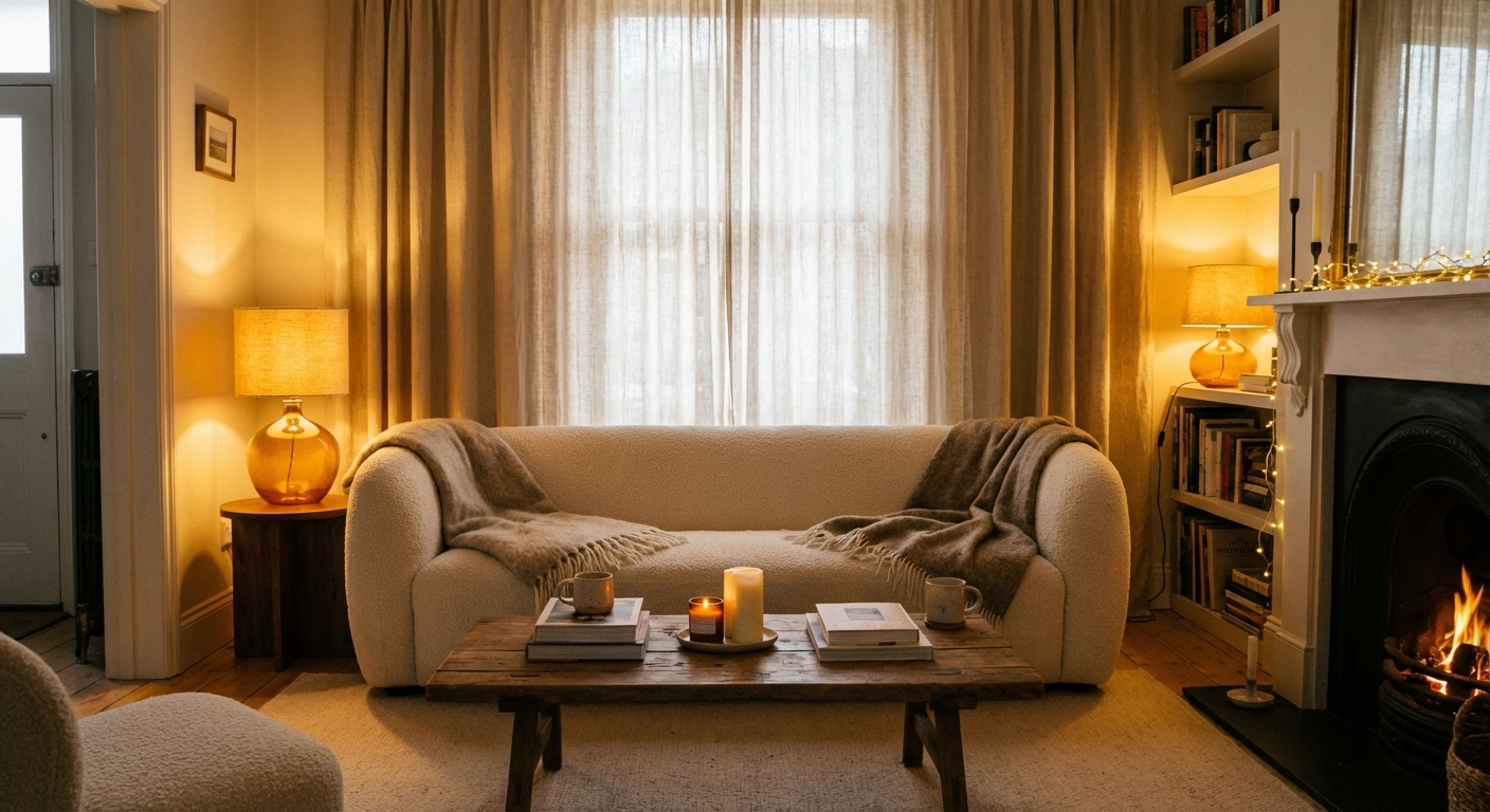
Gray had a long, meaningful run. It was “safe,” it photographed well, and it made open-plan spaces feel calm. The problem is that when everything is gray, the room can start to feel a little clinical. Cool gray walls, cool gray floors, cool gray sofa, cool gray rug. Your home deserves a little pulse.
Try instead: warm neutrals with one true color
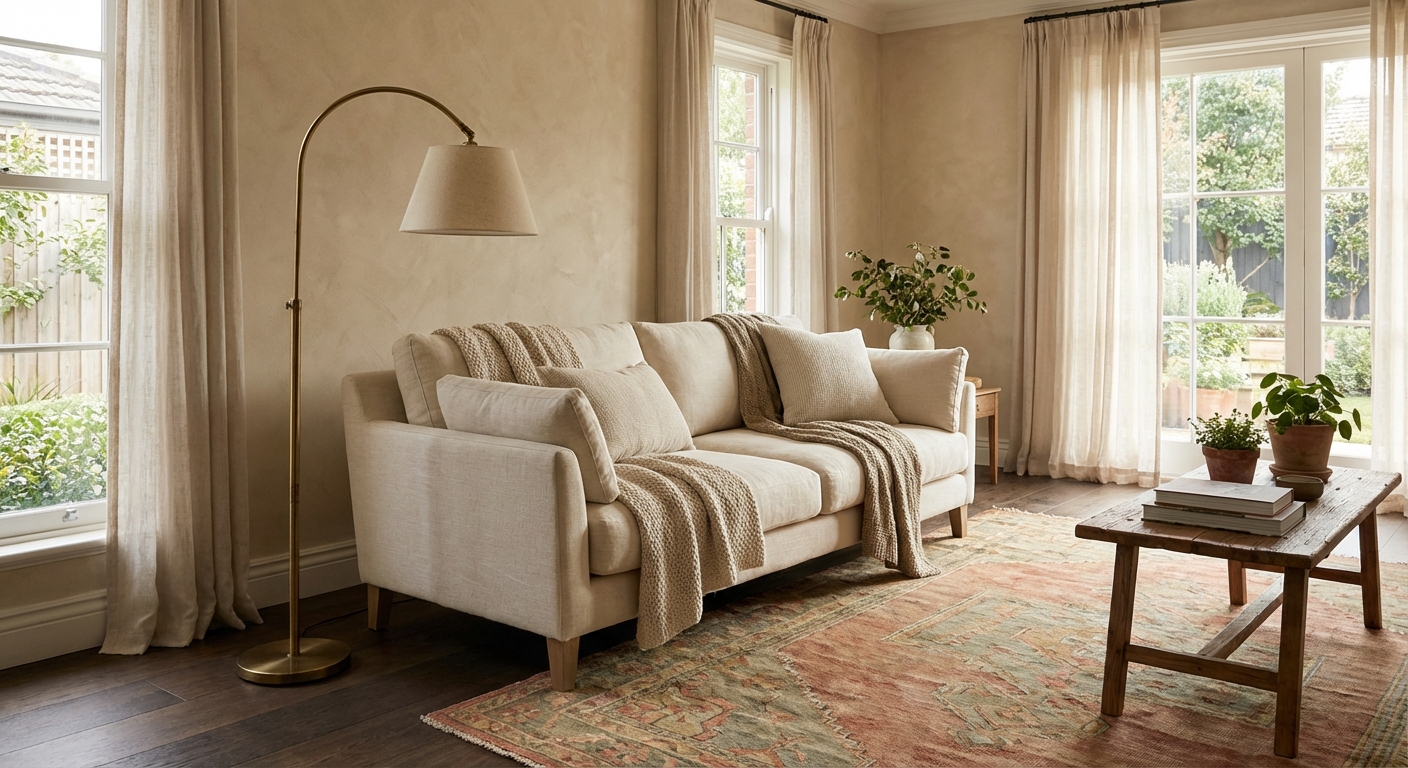
Swap chilly gray for warmer neutrals that still play nicely with almost anything: creamy off-white, putty, oatmeal, mushroom, camel, soft clay. Then add one color you actually love, not one you think you should love. That color can be a painted side table, a vintage rug, or even a bold lampshade.
- Easy switch: Paint is one of the fastest mood-shifters. A warm white or soft greige (the warm kind) can instantly lift the room.
- Texture hack: If repainting is not happening this week, bring warmth through texture: a nubby wool throw, linen curtains, a wood-toned frame, or a brass sconce.
- Color tip: Choose one “hero” color and repeat it 2 to 3 times in small doses, like a pillow, a book spine, and a vase.
2) The matchy-matchy furniture set
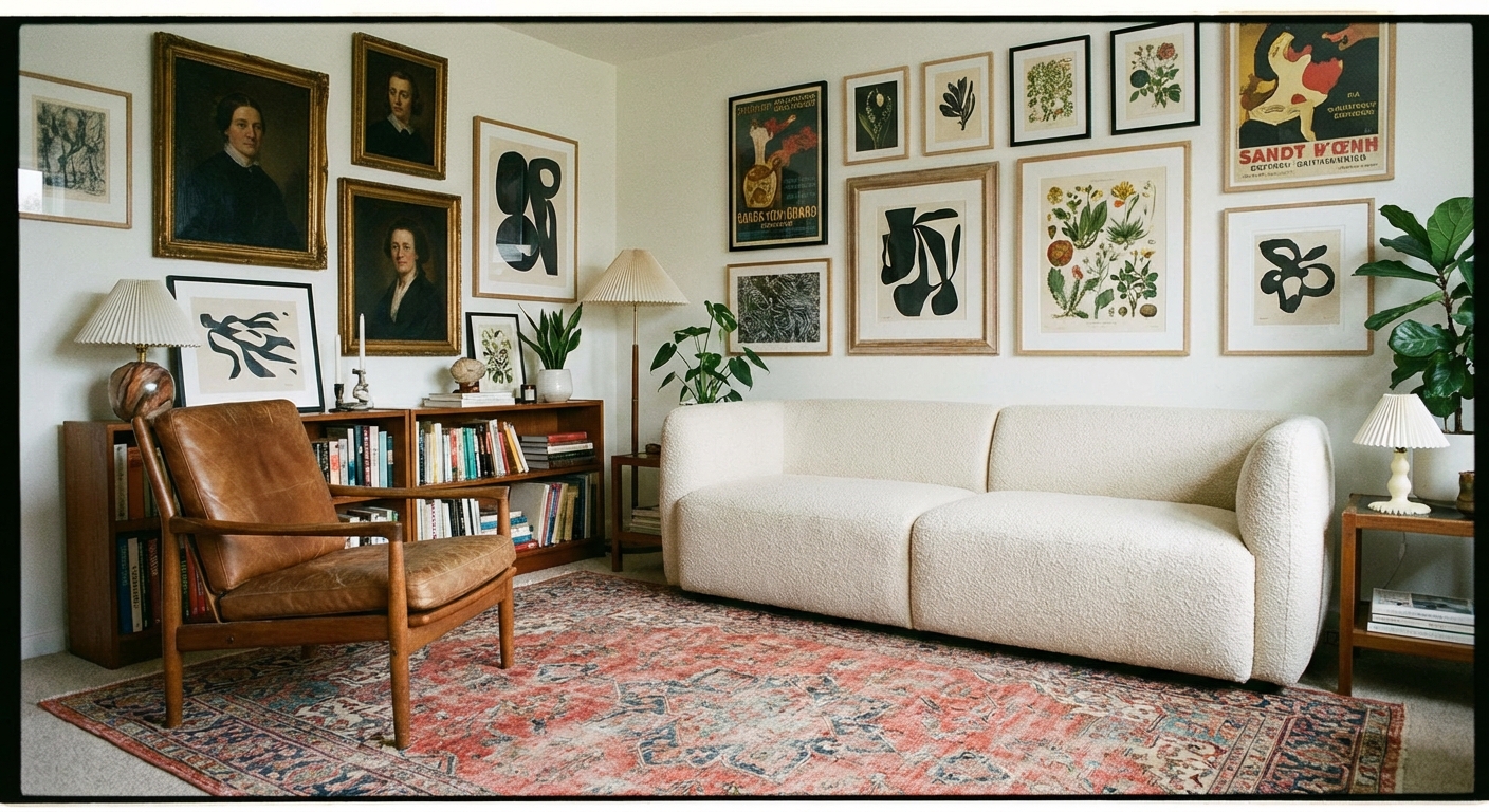
If your sofa, loveseat, chair, and coffee table all came together, it can read a little showroom. Not because it is “wrong,” but because many real homes look better when they feel collected over time. The best rooms have a bit of friendly tension: old next to new, sleek next to worn-in, smooth next to textured.
Try instead: a collected mix with one repeating element
Mixing does not mean chaos. Give yourself one repeating element so the room still feels intentional. That might be the wood tone (walnut throughout), the metal finish (aged brass), or a color family (warm earth tones).
- Start small: Keep the sofa, swap one side chair for a vintage find with character.
- Make it feel cohesive: Tie pieces together with textiles, like one rug that includes a few of your room’s main colors.
- Thrift-store secret: Look for solid frames and good bones. Fabric can be changed. Wobbly joints are harder.
3) Word art and scripted wall quotes
“Gather.” “Blessed.” “Live Laugh Love.” I get it. The goal was warmth and personality. But now it can land as a little generic, like the room is speaking in stock phrases. Your home can say who you are without spelling it out in cursive.
Try instead: art and objects from your life
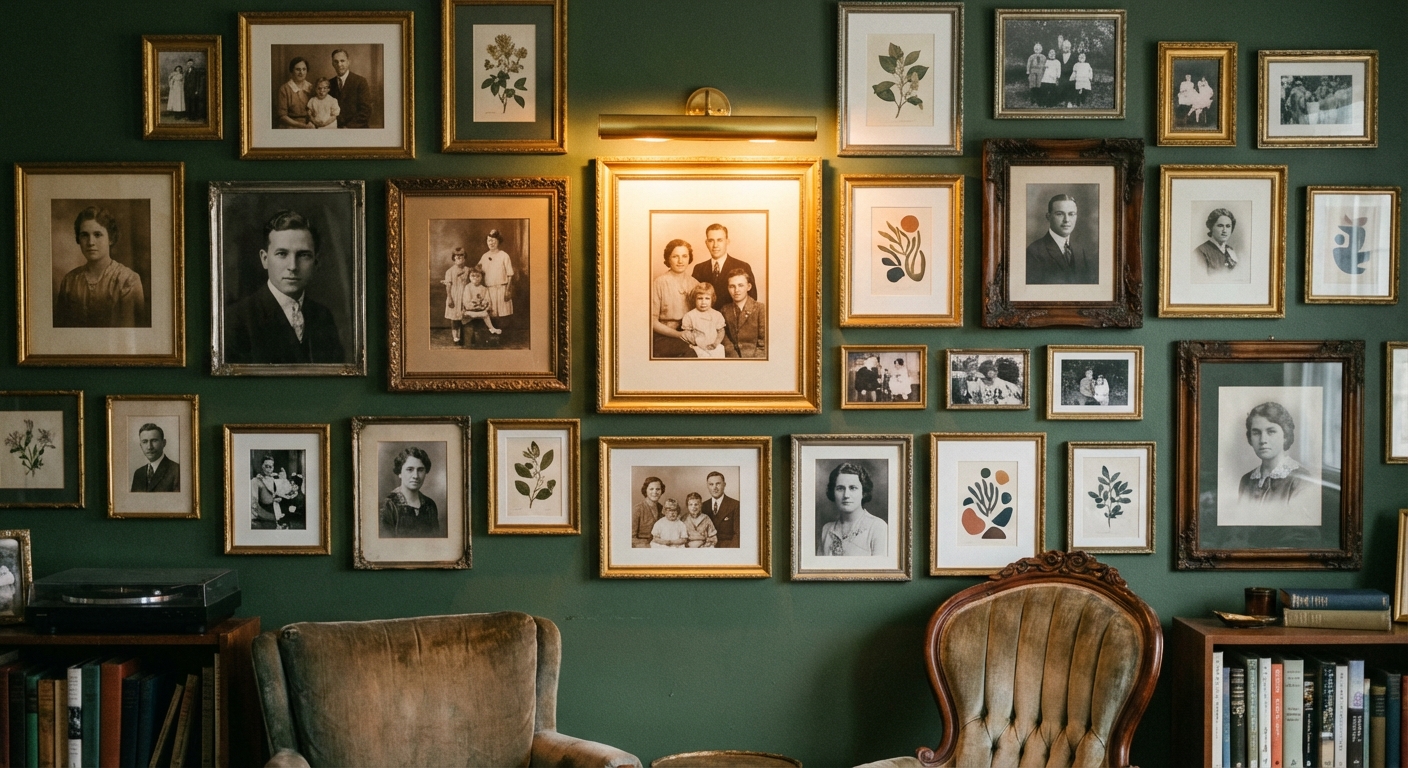
Trade word art for pieces that feel specific: a thrifted landscape that reminds you of childhood summers, a framed concert poster, a black-and-white photo of your grandparents, a small painting from a local artist.
- Gallery wall shortcut: Pick a loose theme (nature, portraits, travel, abstracts), then mix frame styles but keep one unifier, like all warm woods or all black frames.
- Budget win: Frame pages from old books, sheet music, or vintage maps you find at flea markets.
- Make it feel intentional: Hang art at a comfortable eye level. A common guideline is to place the center of the piece around 57 to 60 inches from the floor, then adjust for your ceilings and furniture.
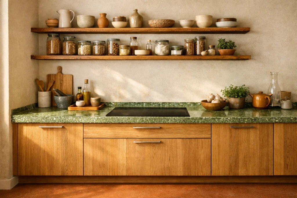
4) Overdone open-shelf styling
Open shelves can be gorgeous. But when every shelf is a perfectly spaced line of matching white dishes and identical canisters, it starts to feel more like a set than a kitchen. Also, real life happens in kitchens. If your shelves are making you anxious, they are not doing their job.
Try instead: practical storage plus relaxed display
Keep open shelving, but style it like a human lives there. Mix everyday items with a few special ones. And if you are craving calm, add more closed storage where you can.
- Use a simple guideline: Aim for mostly functional items (plates, bowls, glasses) with a smaller layer of “pretty” (a ceramic pitcher, a small framed print, a plant).
- Vary heights: Stack plates, stand a cutting board upright, add one taller object to break up the line.
- Hidden help: Add a simple cabinet or a closed credenza nearby for the not-cute stuff.
5) Random accent walls
Some accent walls are timeless, like beadboard or a well-chosen paint color that makes architectural sense. But random geometric paint shapes, overly busy stencils, or one dark wall that has nothing to do with the rest of the room can feel like a leftover experiment. If you love it, keep it. If it feels like a costume, it might be time to edit.
Try instead: subtle texture and tonal contrast
Right now, many of the most compliment-getting “wow” walls are the ones you feel more than you notice. Think limewash, plaster-look paint, grasscloth-style wallpaper, picture molding, or a soft, tonal paint treatment that adds depth without shouting.
- Paint option: Try a chalky, mineral finish that shifts subtly in different light.
- Trim option: Add simple picture-frame molding and paint it the same color as the wall for a tonal, elevated look.
- Wallpaper option: Choose texture over pattern if you want it to age well, like linen-look or grasscloth-inspired styles. Renters can go peel-and-stick, then keep the rest of the room calm.
Quick reset: 10 minutes
If you want an immediate refresh without buying a thing, here is my favorite mini-reset. Put on a playlist, pour something warm, and do this once through your main living space. Consider it the “make it feel current” bridge between big changes and real life.
- Turn off the overhead light and switch on two to three lamps.
- Clear one surface fully, like your coffee table, then put back only what you use or love.
- Add one natural element like a branch in a vase, a bowl of citrus, or a small plant.
- Layer one textile like a throw at the sofa corner or a runner in a hallway.
- Lower art if it is floating too high. A handy starting point is centering it around 57 to 60 inches from the floor, then adjusting by eye.
Design trends come and go, but a home that feels personal never goes out of style. If you ditch just one outdated habit this month, let it be the idea that your space needs to look like anyone else’s. Your best room is the one that looks like you.